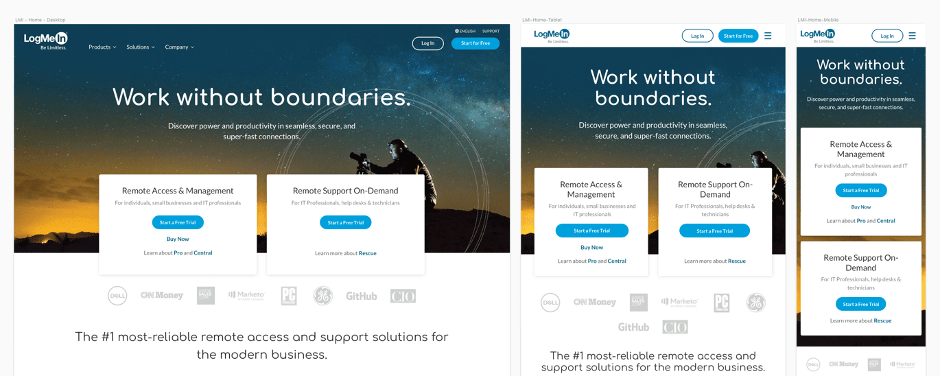
Each of the three pages required an entirely responsive design treatment. Much of the layout was stacked as you can see on the homepage hero. I created a new responsive type scale which increased the font size and spacing on mobile for legibility.
Role: IA, Mobile Prototypes, Design
Company: LogMeIn
LogMeIn has an expansive portfolio of products and each one has a dedicated site with many unique paths to purchase. In addition to each product site, there is an all-encompassing site where visitors can learn at a higher level about each of the LogMeIn products. In 2019 I took over as the sole designer on the team responsible for this site, which was in the process of a transformation.

Shortly after I joined the team, our web analyst had announced a successful test of a previously redesigned homepage, products page, and solutions page. While these new pages had passed the test, they had only been tested on desktop, and responsive designs of the new pages were non-existent.
For us to roll out the new pages for all visitors, I would need to first design the pages for tablet and mobile screen sizes, including a new mobile menu and navigation. My goal was to keep the overall design as close to the original as possible, without sacrificing usability, straying from the successful test results.
I started by familiarizing myself with the previous designer's Sketch file and updated it to match the live environment. I went through a comprehensive UX heuristic evaluation, focused on usability, accessibility, and overall experience. I identified which sections could easily be translated to a narrow viewport, and which would need to be redesigned on desktop entirely, to function well across all sizes.

Each of the three pages required an entirely responsive design treatment. Much of the layout was stacked as you can see on the homepage hero. I created a new responsive type scale which increased the font size and spacing on mobile for legibility.

Some of the layout translated well over to tablet and mobile, and I modified some sections to best use the space. I followed consistent spacing amongst sections and ensured vertical rhythm on mobile devices.

The first section that needed to be redesigned across all sizes including desktop was the interactive product tabs on the homepage. This section was failing for usability, accessibility, and would not translate well to smaller viewports.

After a few iterations, I settled on this new, more accessible design, by using contrast in the tabs and clearly highlighting which product is selected.

I removed the background image for tablet and mobile to improve legibility and also simplified the tabs. Next, I met with the front end developer on the team to ensure the interactive components would work well on mobile.

I built an interactive prototype using Axure to demo the scrolling navigation functionality, which would become sticky when scrolling, making it easier to navigate between the 3 sections without missing context or important information. This MVP prototype took the guesswork out of the functionality and sped up the development and QA process.

Next was the navigation, which I began by collaborating with another designer on my team to make sure we were both using similar patterns. The redesigned mobile navigation uses an accordion pattern, which is consistent amongst other LogMeIn products.

With the navigation design complete, I created another clickable prototype in Axure to demonstrate to my developer how it should function, to guarantee we were on the same page and that it was feasible. I used dynamic panels to accurately show and collapse the sections, mimicking the actual functionality.

Now that all three pages were designed, I handed off the final Zeplin link for the developer to review. He then built each of the components in React, and I reviewed them for accuracy. We worked closely to confirm consistent styles, spacing, and most of all, usability before moving into the live environment.
Upon final review with the front end developer we were ready for back end development, the last step before deployment. We not only were ready to launch the new pages, but we had a new foundation of components in our React library to build from for other products and pages.
This process proved to be successful, and I shared with the larger UX team the prototypes so they could use them for their pages as well. I emphasized the value of clickable prototypes for developer handoffs, as we not only saved time going back and forth but now had a high-fidelity prototype of mobile navigation in our toolkit.