Business Problem & Challenge
Device fragmentation, retailer flexibility, and asset management complexity made it hard to deliver consistent, high-quality experiences. Brands needed to add, edit, and configure multiple retailers and custom redirects, while supporting both images and videos responsively. We also had to maintain backward compatibility for legacy integrations.
- Device Fragmentation: Consistent experience across all devices and breakpoints
- Retailer Flexibility: Rapid configuration of multiple retailers and redirects
- Asset Management: Support for images/videos, performance, and visual quality
- Migration & Backward Compatibility: Support legacy templates while rolling out new features
Research & Data-Driven Design
We conducted user interviews, benchmarked against industry best practices, and analyzed onboarding bottlenecks. Prototyping and live user testing in Figma validated new flows. Key decisions included progressive enhancement (mobile-first, scaling up), standardized file specs, modular components, and automated flows for updating product assets. Clear documentation and handoff files ensured smooth transitions between design and engineering.
- User interviews and feedback sessions with brand partners
- Benchmarked against industry best practices and competitors
- Prototyped and tested new flows in Figma and live user testing
- Progressive enhancement: mobile to desktop, supporting all breakpoints
- Automated onboarding and asset management flows
Responsive Commerce Template System in Action This MyMochi Brand.com prototype demo showcases the template system in real-world application, demonstrating progressive enhancement with optimized layouts across desktop and mobile platforms. The initial phase focused on establishing responsive breakpoints and improving user experience across all screen sizes, highlighting the adaptability and flexibility of the system.

Comprehensive Breakpoint Matrix This image illustrates the extensive range of breakpoints and scenarios we accounted for in our design system. Each breakpoint was carefully considered to ensure optimal user experiences across a multitude of devices and screen sizes.
Figma Preview: Adaptability Across All Screen Sizes Our robust Figma system enabled comprehensive testing and previewing of content across various screen sizes and scenarios. This ensured that designs were not only visually appealing but also functionally effective on any device.

Engineering Specifications: Container and Breakpoint Details Clear communication with engineering regarding breakpoints and container sizes was paramount. This documentation clarifies the max-width for engineers and specifies column percentages, ensuring a consistent layout and design across diverse screen sizes and maintaining design integrity.

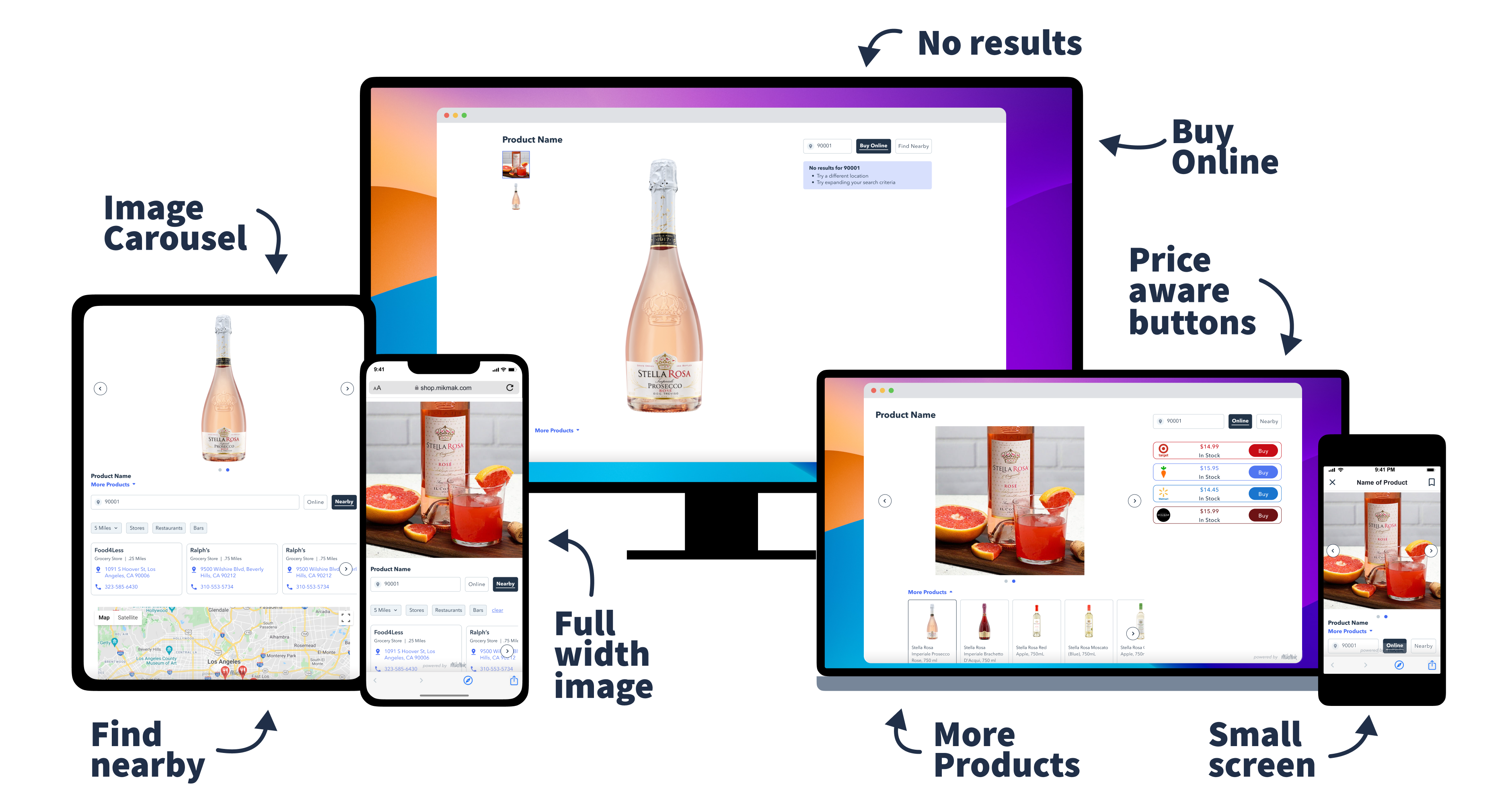
Mobile and Tablet Breakpoints: Optimizing Retailer Button Visibility This demonstrates the template's functionality across various sizes for brand websites, including online and in-store tabs. The visibility of retailer buttons on smaller mobile sizes was a key consideration, ensuring seamless conversion opportunities.

Retailer Button Layout Optimization: Top-Down vs. Bottom-Up Alignment A critical aspect of our template system was optimizing retailer button placement. We compared two approaches: bottom-up alignment for creative-focused templates and top-down alignment for discovery-focused layouts. Testing revealed that while bottom-up alignment worked well with rich media backgrounds on mobile, it needed refinement for larger screens to maintain both visual impact and conversion effectiveness.
Figma Interactive Prototype: Top-Down Responsiveness Animation This video showcases various scenarios being tested, with a feature list on the left. By updating content in one central location, we could instantly preview the impact across different devices, streamlining the testing process and ensuring consistency.
Hero Image Adaptation: Optimizing for Conversion and Branding Previewing video and animations across different screen sizes posed a unique challenge. Our innovative solution involved creating an automated animation using Figma's smart animate feature with a time delay trigger for looping. This allowed real-time visualization of content behavior across various devices without manual browser adjustments.
Figma System Configuration: Device and Settings Demonstration This video demonstrates the system's configurability, showcasing how different devices and settings can be adjusted within Figma. This flexibility allowed us to tailor the user experience to specific contexts and requirements, ensuring optimal performance and visual appeal across a wide range of scenarios.
Streamlining Design: Efficient Device Duplication and Content Management To streamline the repetitive task of copying and pasting content across different form factors, we nested the single product image, allowing it to be sized once and then duplicated across devices. This, along with similar techniques for text, enabled rapid testing of numerous combinations of brand and product assets, significantly accelerating the design process.
Rapid Scenario Testing: Automated Multi-Scenario Demos Addressing the limitations of previewing animations and videos in Figma, we initially used Google Slides to create a grid of examples showcasing various brand assets and scenarios. This included variations in background images, colors, retailer button counts, and screen sizes, providing a comprehensive overview in a single slide.
Mobile Responsiveness: Figma Animation Demo This video demonstrates the responsiveness animation on mobile devices within Figma, showcasing the dynamic adaptation of content to smaller screen sizes and highlighting the mobile-first approach of our design system.
Edge-to-Edge Images: Implementation and Social Media Optimization In response to a popular feature request, we implemented edge-to-edge images at 100% width. This enhancement required careful consideration to ensure ease of setup, scalability, and high image quality. Research into common social media image treatments led us to adopt a 1:1 aspect ratio, with options to either fill the screen or maintain padding at smaller sizes, providing flexibility for different content types.

Enhanced Search Functionality: Improving User Navigation Building upon our responsive design system, we introduced search enhancements to improve user navigation and content discovery. These enhancements were designed to seamlessly integrate with the existing template system, providing a consistent and intuitive user experience across all devices.
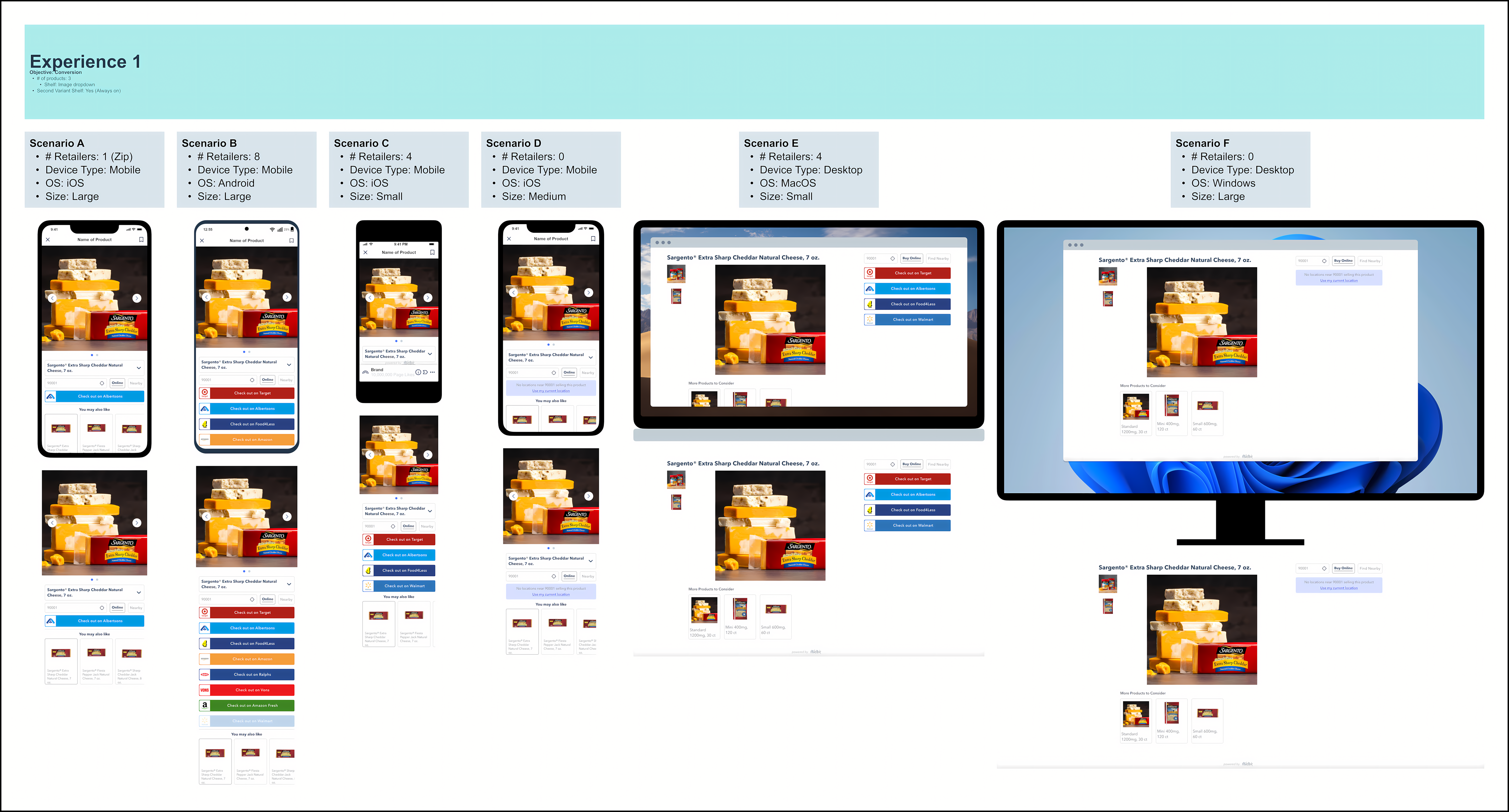
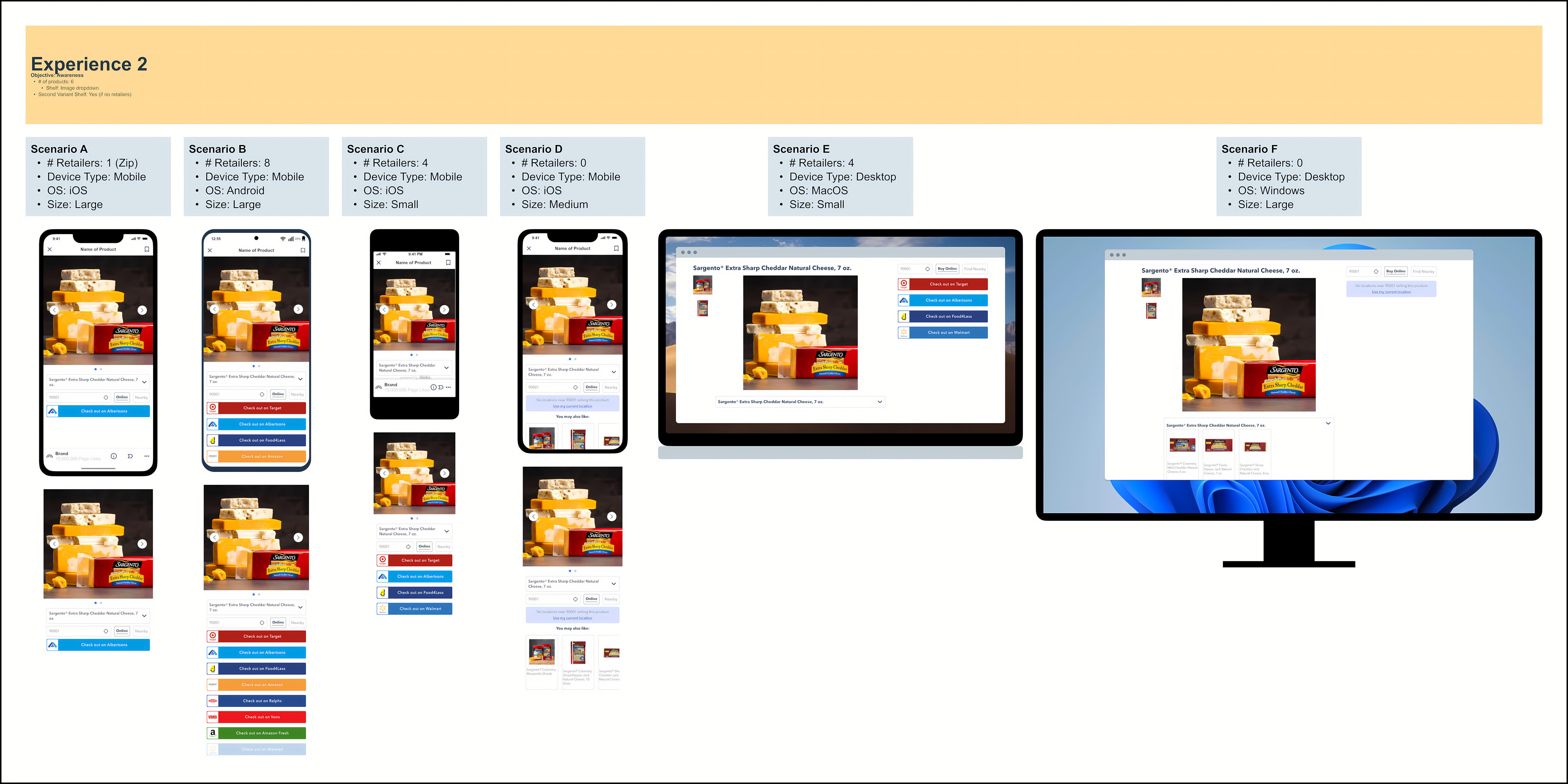
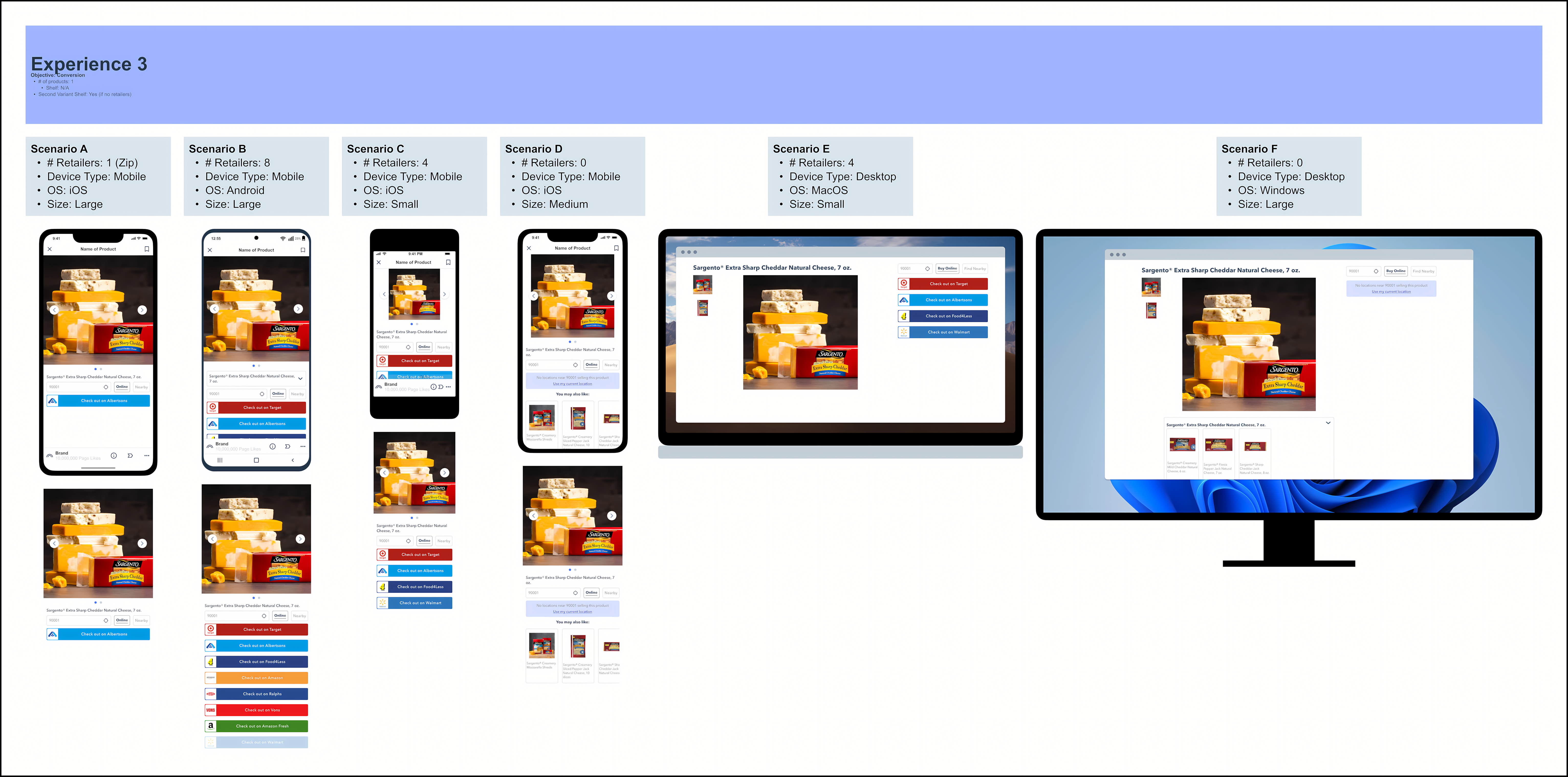
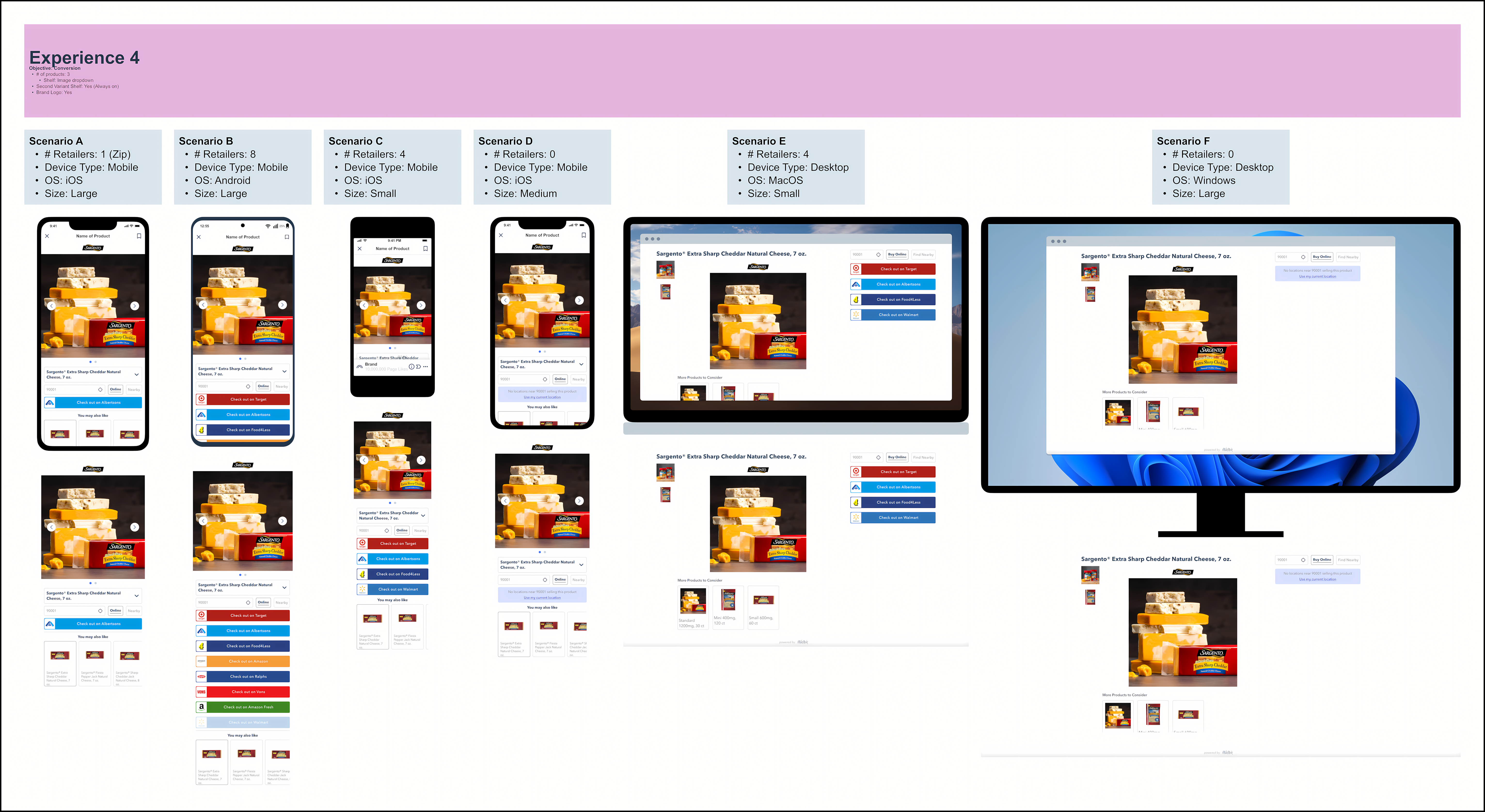
Testing Various Scenarios With Real Customer Assets
Case Study: Ricola's Success
A perfect example of our system's effectiveness was Ricola's influencer marketing campaign. Using our template system, they quickly launched shoppable media experiences across multiple platforms for their cold and flu season push. The results were impressive:
- 2.8x higher purchase intent rate on TikTok compared to the health category average
- 1.6x higher purchase intent rate from top-performing influencers
- 55% of consumers interacting with Ricola influencers showed preference for a specific retailer
This implementation demonstrated how our flexible system could rapidly adapt to specific brand needs while maintaining performance at scale. View Ricola case study (PDF)
Results & Business Outcomes
- Conversion Rate: Brands using the responsive template saw an average conversion rate increase of 12%
- Onboarding Time: Reduced onboarding/setup time by over 30%
- Retailer Flexibility: Brands could configure and launch new retailer options in under 10 minutes
- User Satisfaction: Positive feedback from brand partners and internal teams, with fewer support tickets
Learnings & Next Steps
- Key Insight: Progressive enhancement and modularity are critical for scalable, future-proof systems
- Process Wins: Rapid prototyping, clear documentation, and automated flows accelerated adoption
- Future Roadmap: Continue expanding template flexibility, automation, and analytics for brands
