Business Problem & Challenge
The original onboarding and asset management process was slow, manual, and led to user frustration. Supporting both images and videos responsively was difficult due to inconsistent components and lack of automation. Ambiguity between V1 and V2 implementations caused confusion, and manual effort was required to keep product experiences up-to-date.
- Complex Onboarding: Manual, slow, and error-prone process
- Asset Management: Inconsistent components, no automation, limited video/GIF support
- Versioning Confusion: Ambiguity between V1 and V2, legacy flows persisted
- Catalog Consistency: Manual updates needed to keep experiences current
Research & Data-Driven Design
We conducted user interviews, analyzed onboarding bottlenecks, and benchmarked against industry tools. Figma prototypes and design spikes validated new flows and UI components. We mapped decision trees for onboarding (V1 vs V2), automated product image updates, standardized components, and introduced guardrails to prevent legacy issues. The result: modular, responsive components and automated flows for updating product assets across all experiences.
- User interviews and product council feedback
- Onboarding bottleneck analysis and process mapping
- Figma prototypes and design spikes for validation
- Centralized product feeds and component unification
- Guardrails and validation to deprecate legacy flows
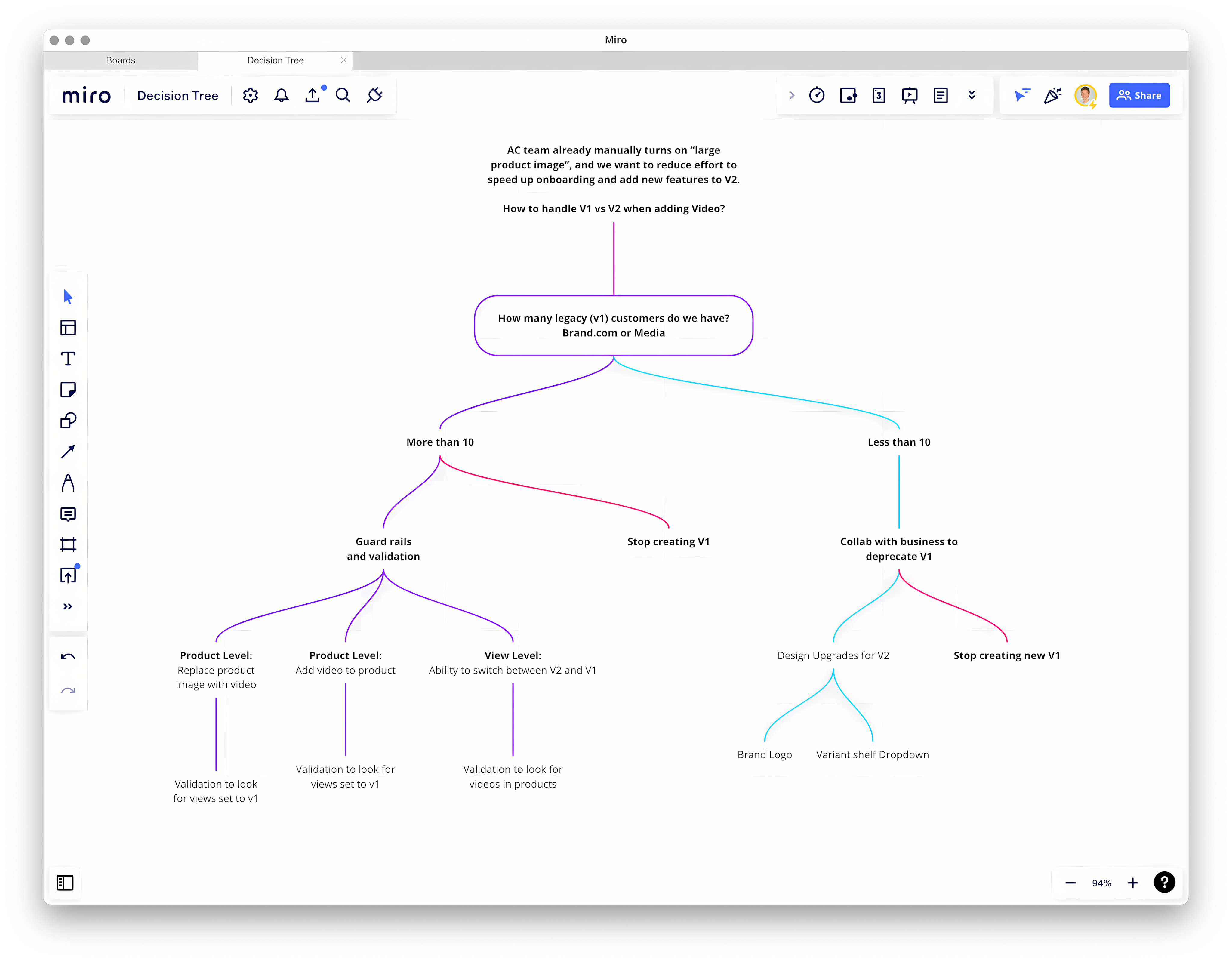
Strategic Decision Tree for V1 vs V2 Collaborated with the Account Coordinator team to create a decision framework for adding video support and managing legacy customers. This systematic approach reduced onboarding effort and enabled a smooth transition to V2's enhanced capabilities.

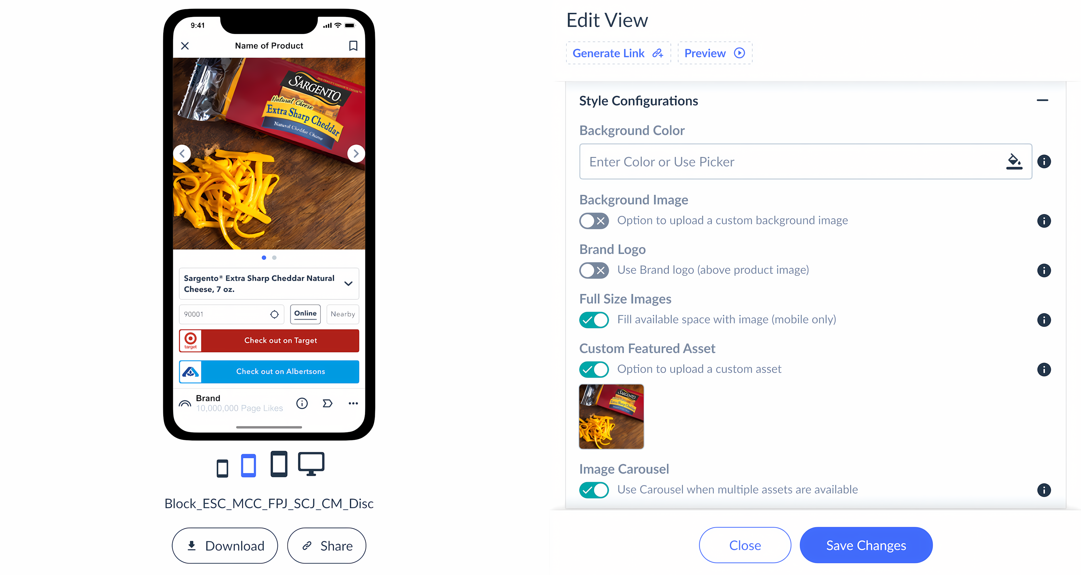
Communicating Feature Enhancements vs Legacy Detailed spec sheets and visual aids clarified the benefits of V2: greater creative control, optimized retailer button visibility, and a default experience designed for maximum impact.
- V1 (Legacy): Limited visual impact and creative control
- V2 Reduced: Optimized for retailer button visibility and premium aesthetics
- V2 New (Default): Maximum visual impact and creative control
Tracking Research and Communication Used Notion to document ideas, problems, and solutions—enabling async collaboration and alignment across teams.
Prototyping and Testing for Quality Assurance Figma prototypes enabled us to test and refine platform flows, ensuring clarity and intuitiveness before development.

Enhancements for Ease of Use Detailed component specs for engineering ensured accurate, effective implementation and faster onboarding.

From Research Insights to Iteration Analysis revealed the need for enhanced creative control, standardized aspect ratios, clear migration paths, and intuitive asset management—directly informing our design decisions.

Uncovering and Fixing Bottlenecks Clear distinction between product and view settings, plus detailed specs, helped engineering implement new features accurately and efficiently.

Future Concept Illustration of potential platform enhancements and new features, supporting ongoing innovation.
Results & Business Outcomes
- Onboarding Time: Reduced by over 30%
- Asset Update Efficiency: Manual update tasks decreased by at least 50%
- User Satisfaction: Positive feedback and fewer support tickets
- Component Reuse: Increased, reducing design and engineering overhead
- Navigation: Faster access from product view to edit mode
Learnings & Next Steps
- Key Insight: Balancing creative freedom with an intuitive, guided user experience is essential for true asset flexibility
- Process Wins: Iterative design, clear communication, and a seamless migration path were critical to success
- Future Roadmap: Focus on advanced analytics, automation, expanded customization, and AI-powered recommendations
