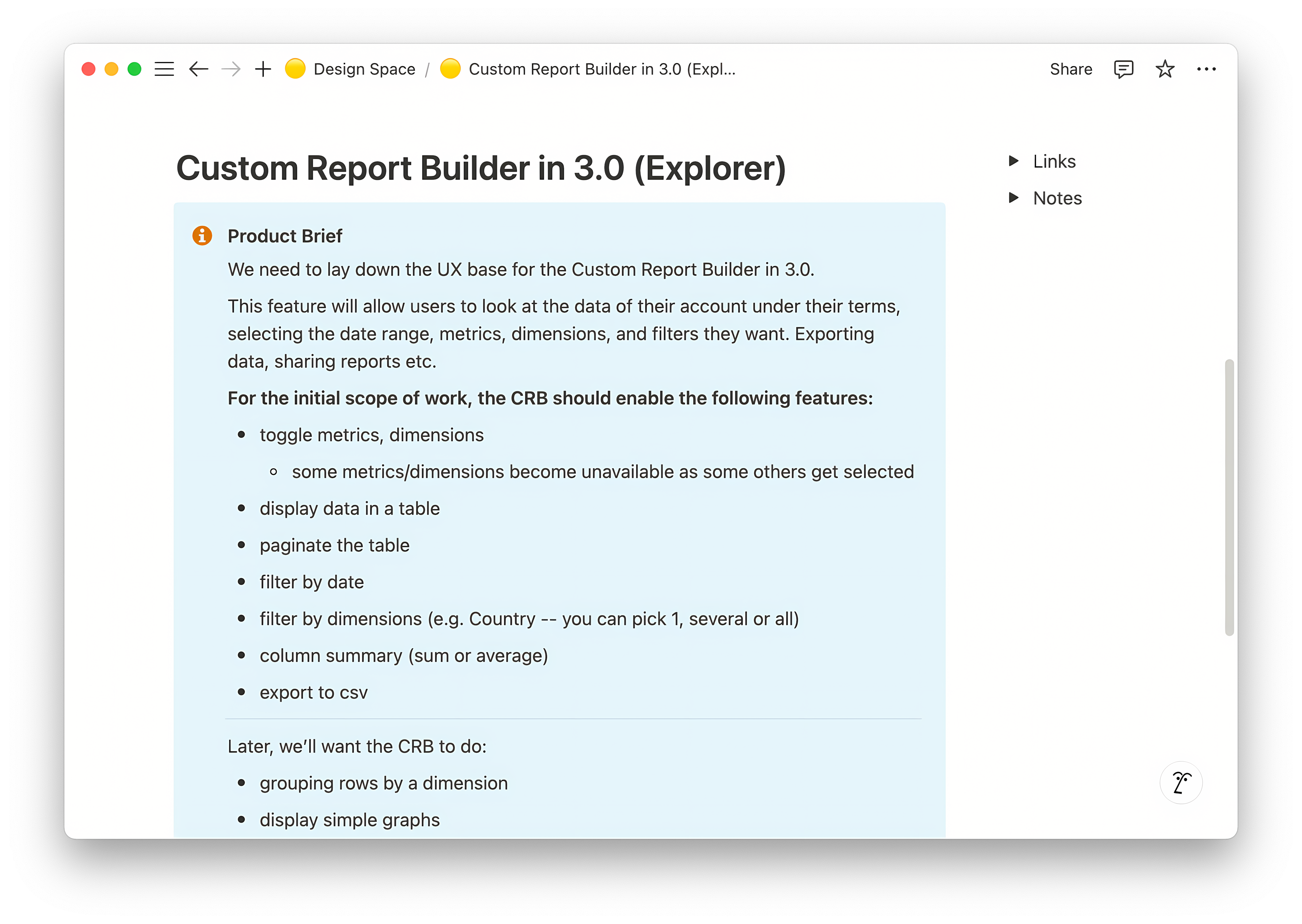
Business Problem & Challenge
We needed to create an intuitive interface that balanced powerful functionality with ease of use for users with varying data literacy. Key challenges included developing a consistent multi-select pattern, designing an effective empty state, implementing permalinks for sharing, and ensuring table alignment and data visualization across devices. All while maintaining feature parity and supporting a seamless migration from the legacy Explorer tool.
- Balance advanced analytics with usability for all user types
- Develop multi-select patterns and clear filter components
- Guide users with effective empty states and onboarding
- Enable sharing and collaboration via permalinks
- Ensure robust table alignment and responsive data visualization
Research & Data-Driven Design
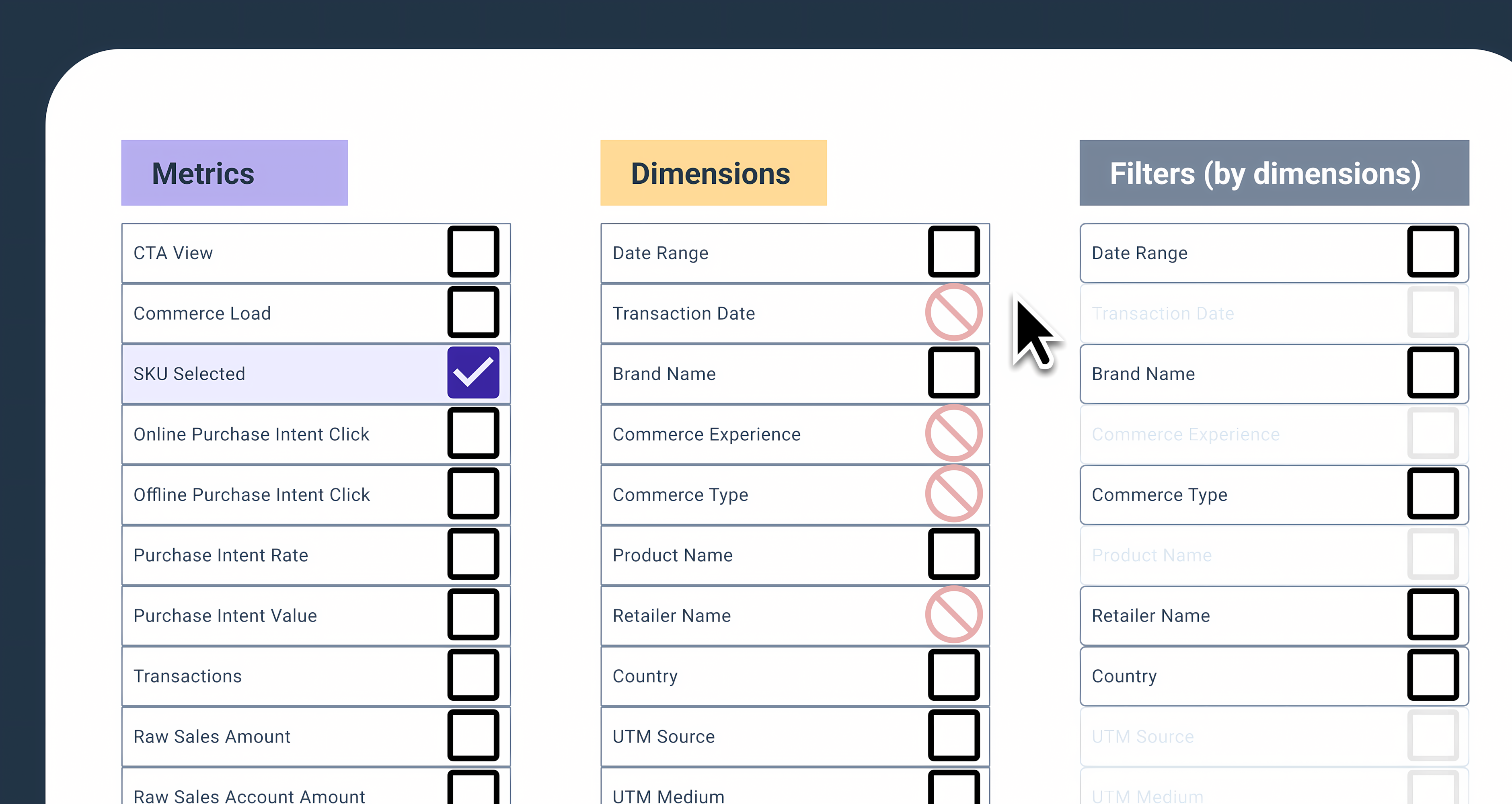
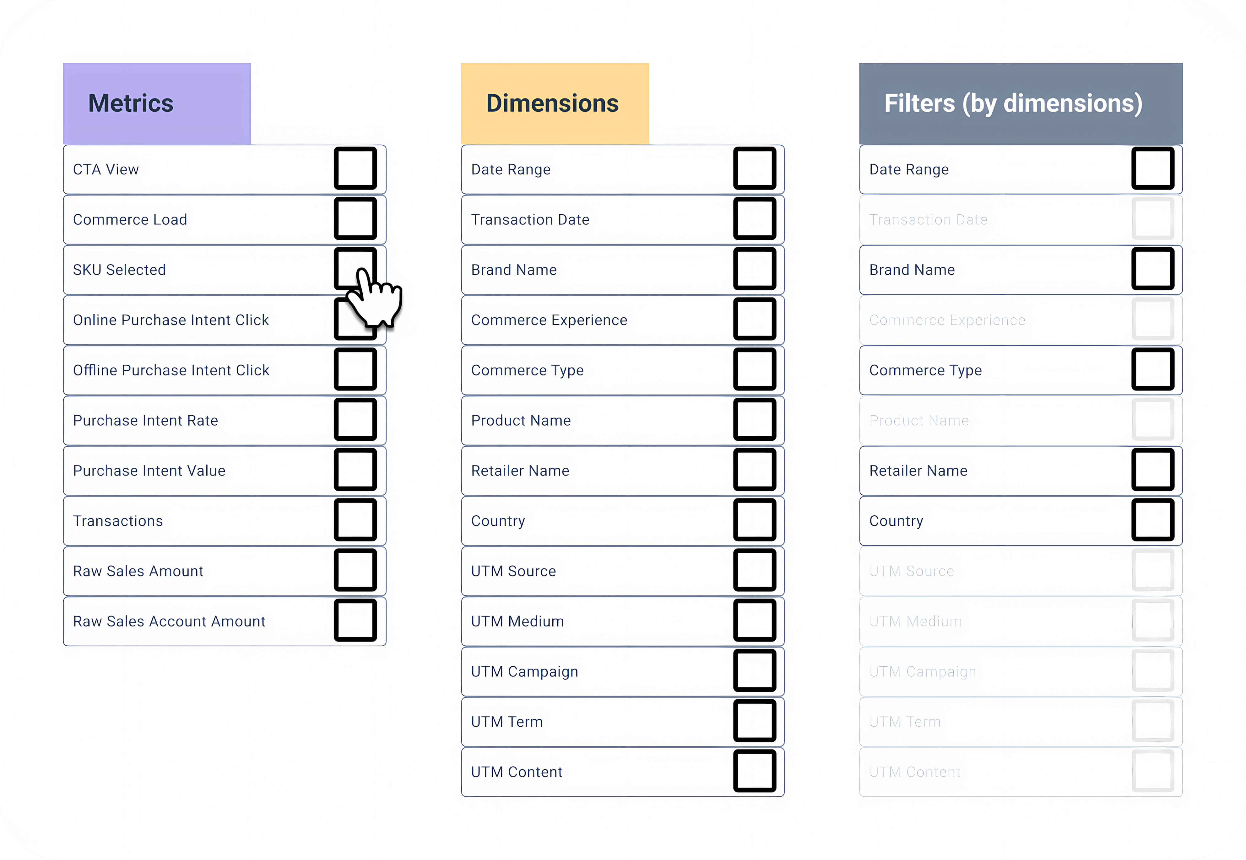
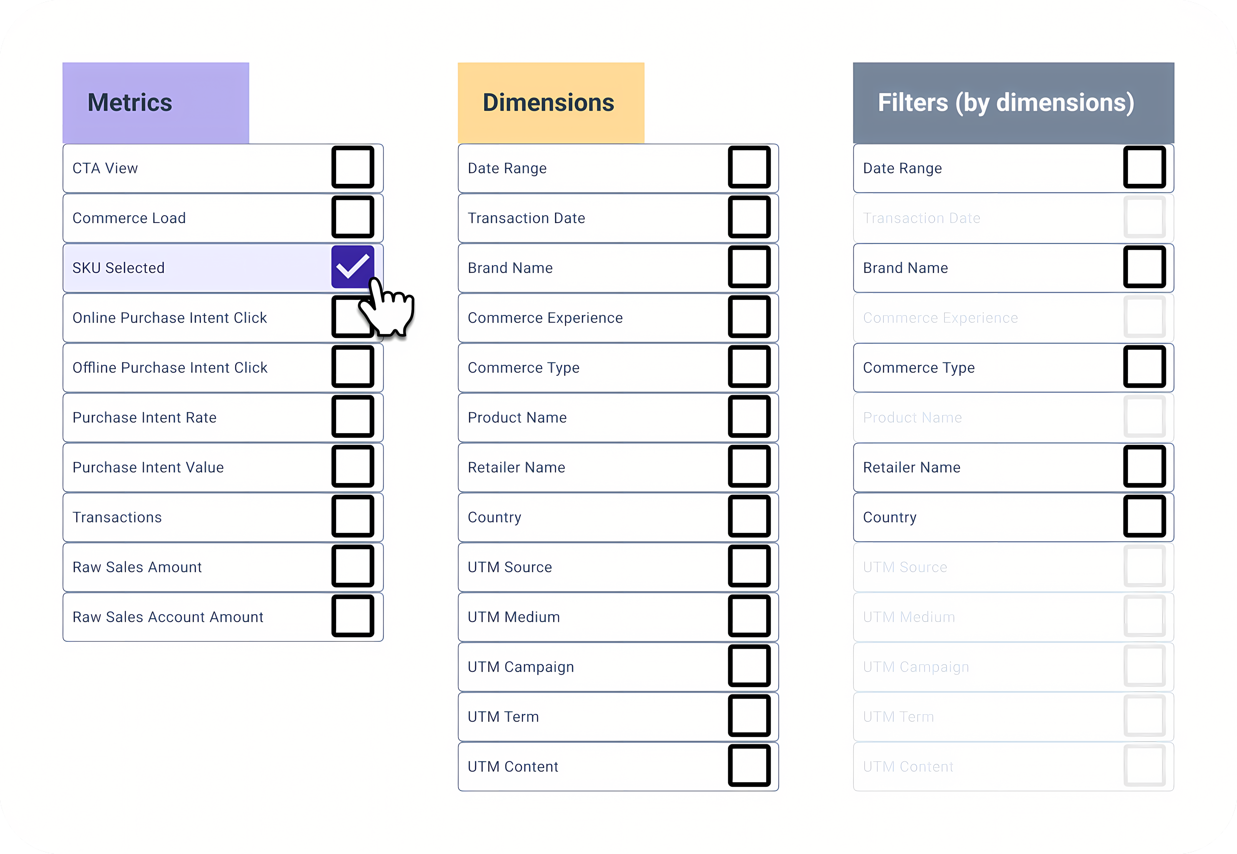
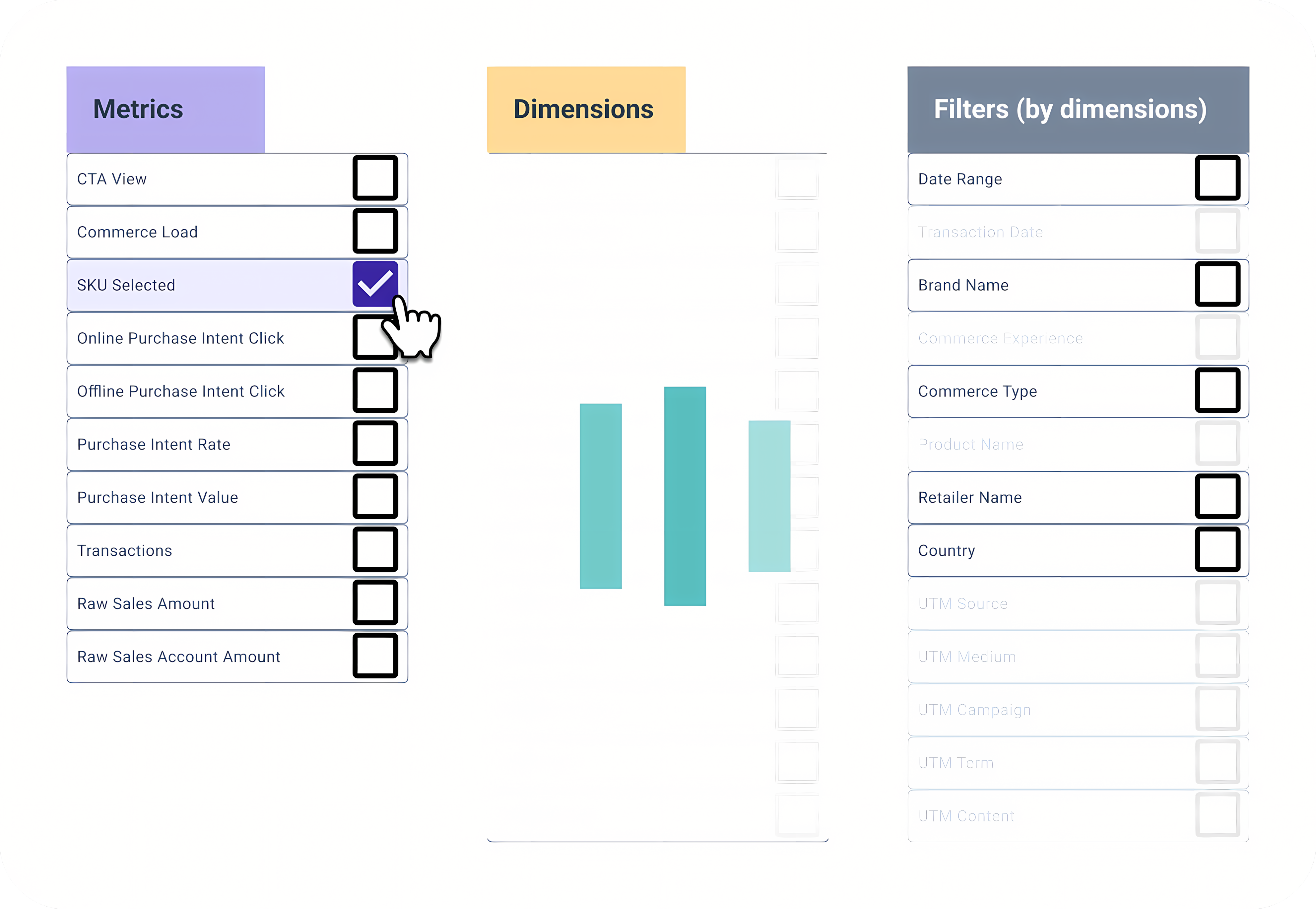
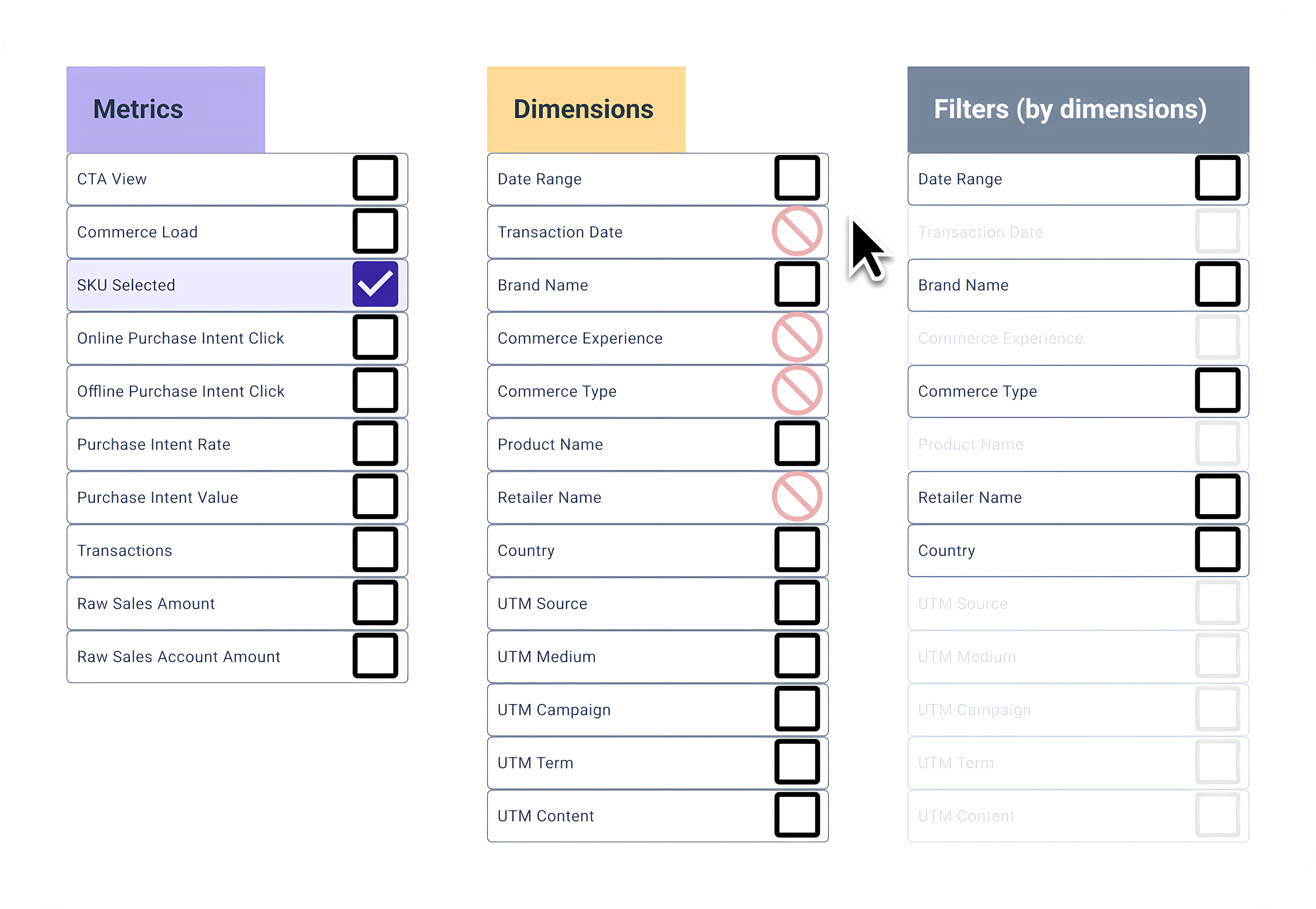
The process was highly collaborative and iterative: multiple working sessions with stakeholders, research into multi-select patterns, and rapid prototyping in Figma. We mapped available/unavailable options for filters and metrics, tested dynamic selection logic, and refined terminology based on user feedback. Close collaboration with Product and Engineering ensured technical feasibility and strategic alignment.
- Stakeholder workshops to align on requirements and vision
- Wireframes and high-fidelity prototypes for rapid iteration
- Mapped filter/metric relationships to inform UI logic
- Continuous user research and usability testing
- Consistent design patterns for faster adoption
Understanding core needs & legacy usage We analyzed legacy workflows and interviewed users to identify must-have features and pain points. Insights like the need for default metrics and requests for enhancements (e.g., column reordering) directly shaped the MVP and roadmap.
Refining terminology and UI User feedback revealed confusion around technical terms. We iterated on terminology, added contextual examples, and improved layout clarity to make the tool more accessible for all users.
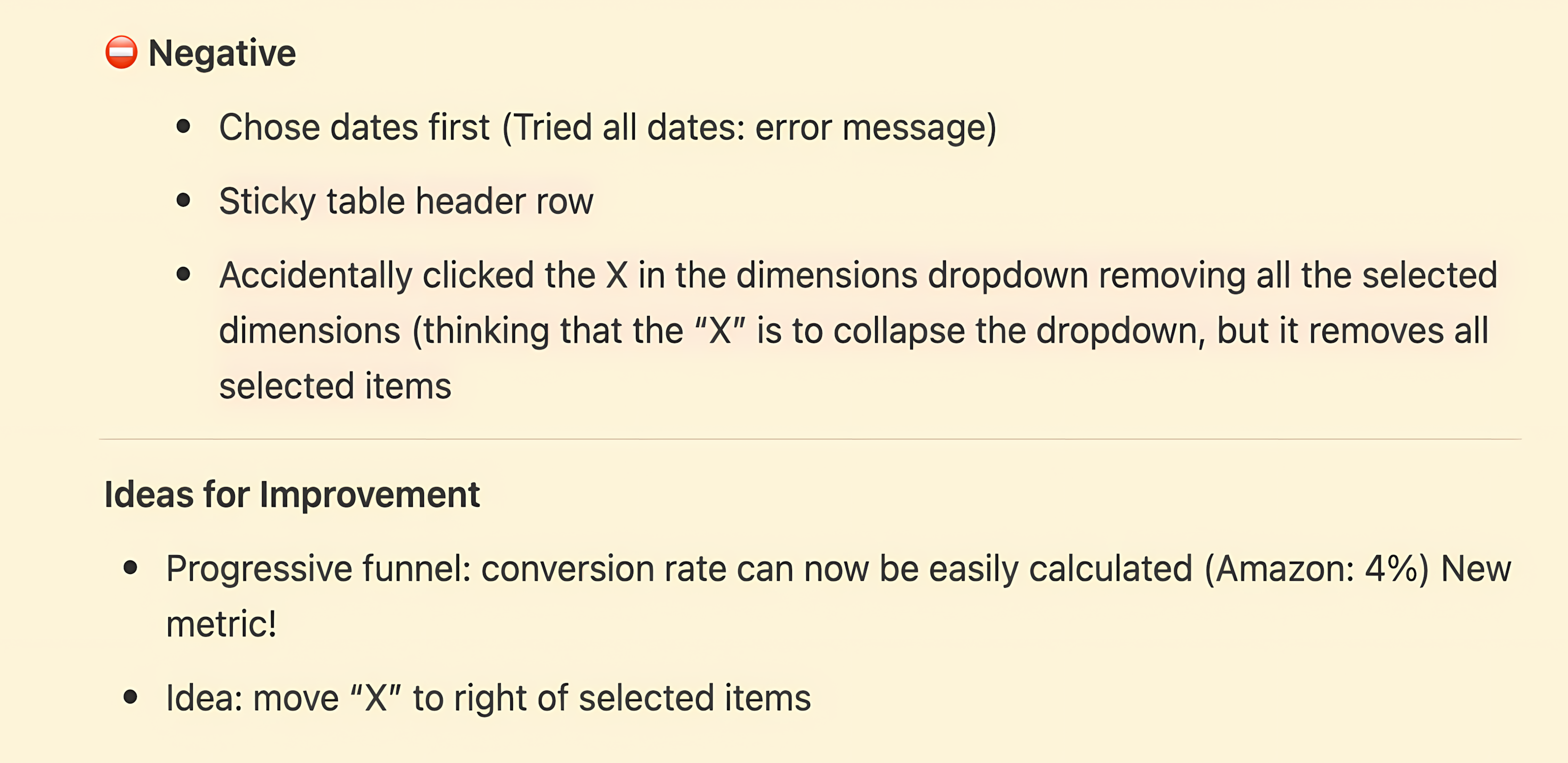
Addressing usability friction Prototyping and user testing surfaced issues like disappearing table headers and confusing icons. We fixed these with sticky headers and clearer iconography, directly improving usability and reducing support requests.

AI-driven insights We used AI prompts in Notion to summarize user testing and generate design patterns, accelerating documentation and knowledge sharing for future projects.
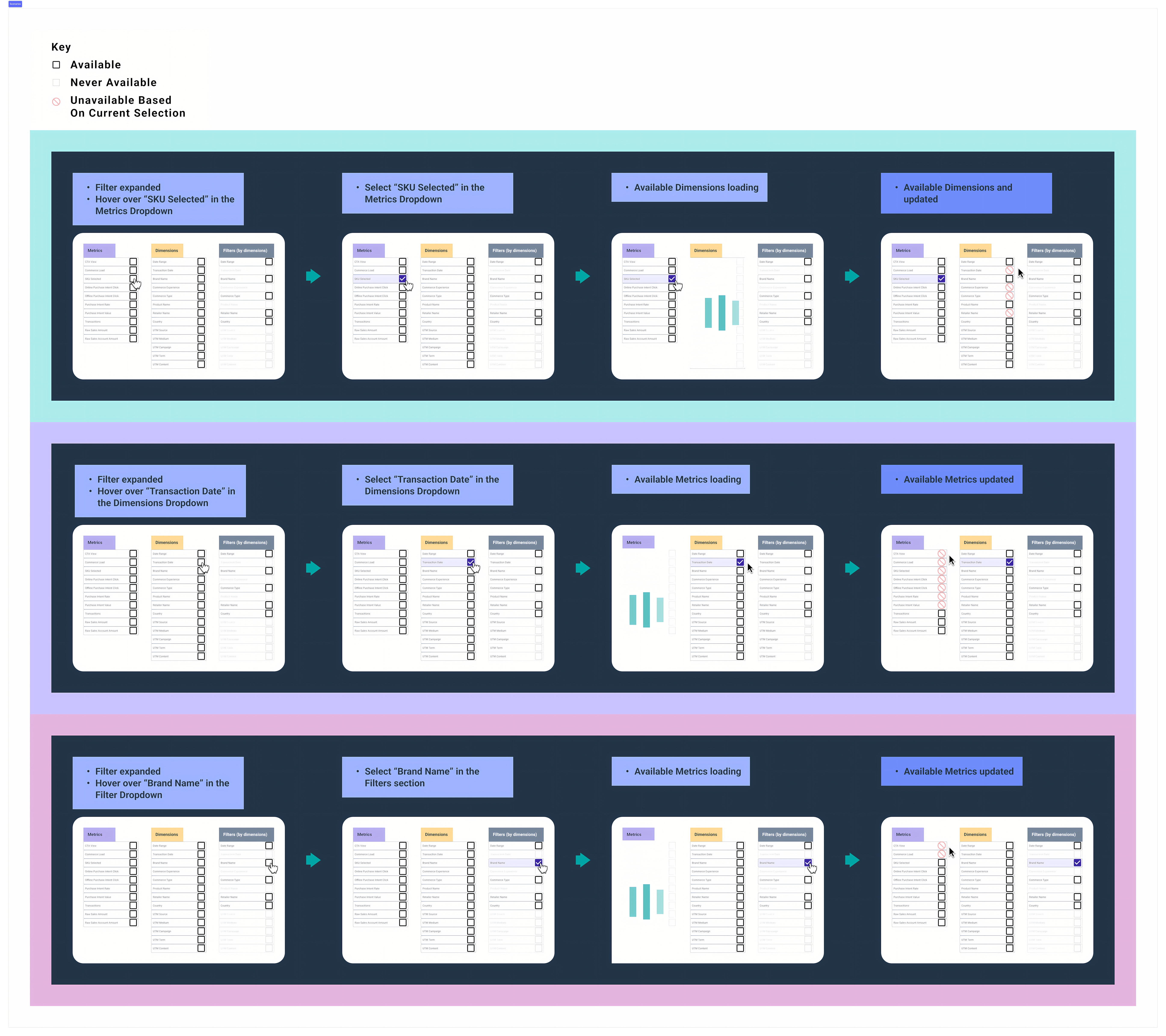
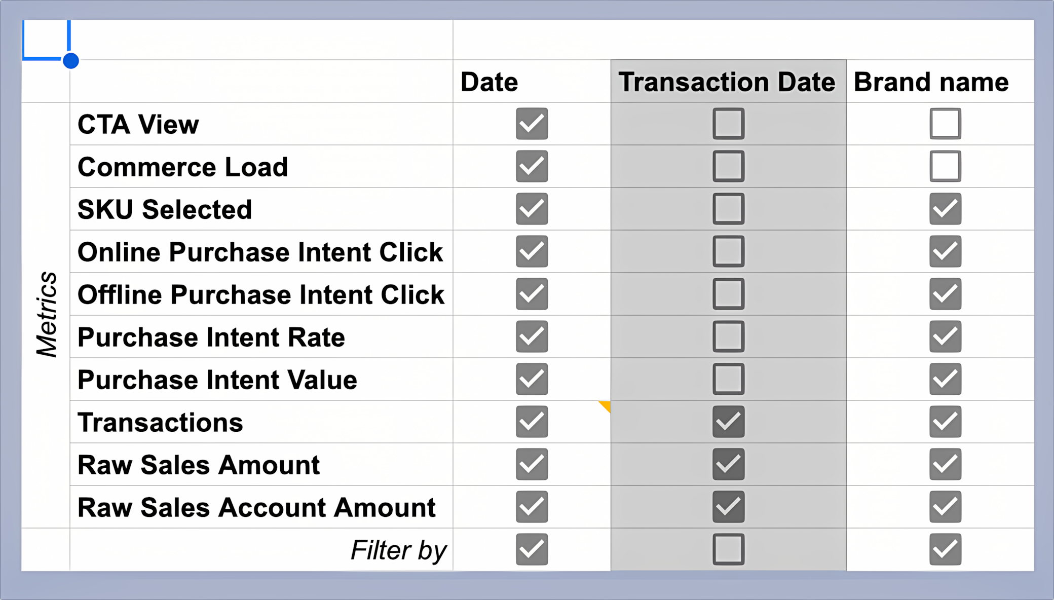
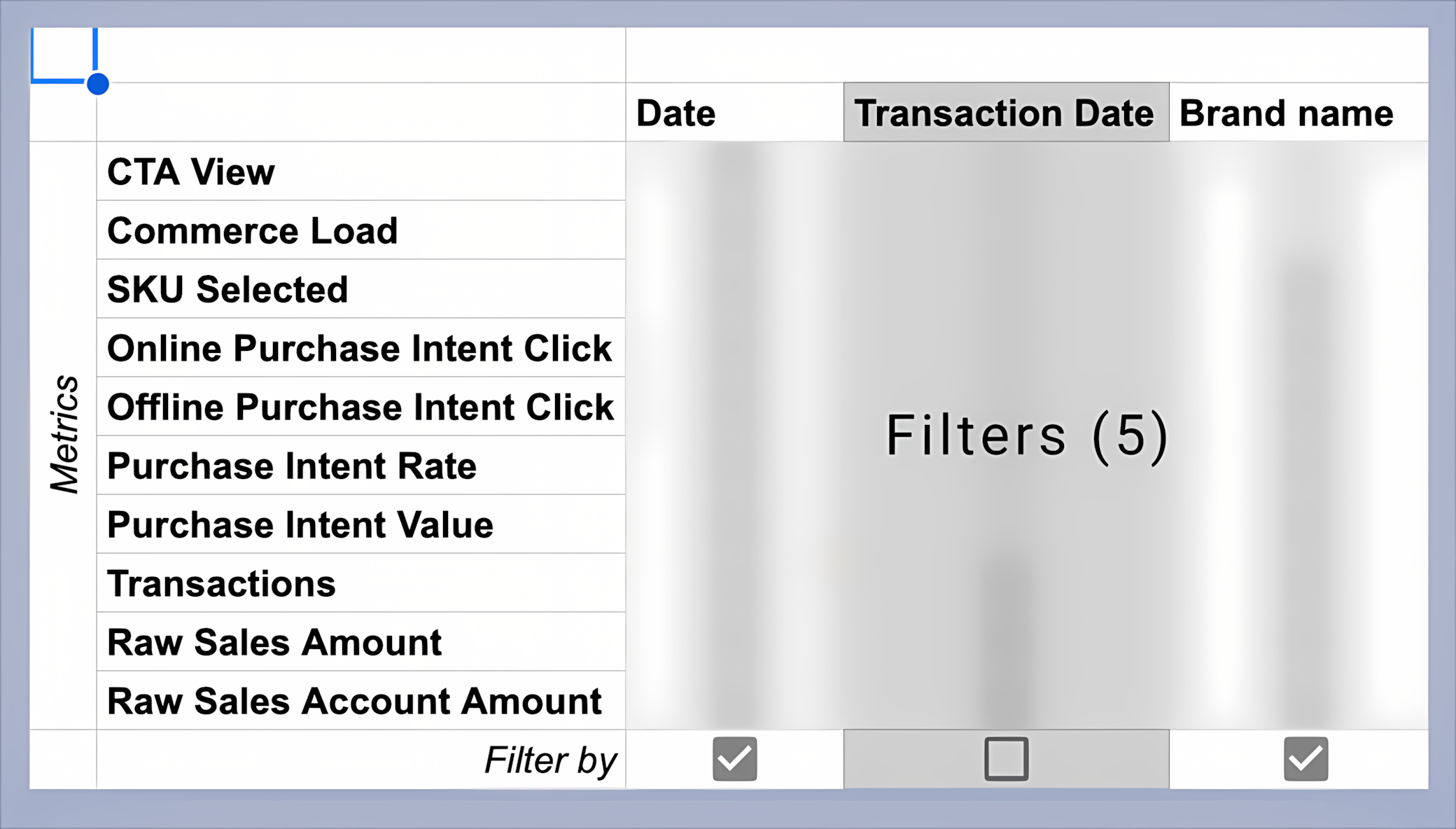
Tackling data complexity We mapped relationships between metrics and dimensions, visualizing constraints to help users understand why some options were unavailable. This made the system more transparent and reduced confusion.
![Column header 'Filter [Metric] by [Dimension]', revised for clarity](/assets/images/portfolio/mikmak/custom-report-builder/carousel-reducing-complexity/3-updated-options.png)
Prototyping interactions Interactive Figma prototypes enabled us to test and demonstrate key flows, including multi-select filters and future enhancements like drag-and-drop column reordering, before committing to development.
Results & Business Outcomes
The Custom Report Builder launched as part of MikMak 3.0, reducing custom report requests by 45%, increasing analytics engagement by 37%, and decreasing time spent searching for data by 60%. Positive client feedback highlighted the flexibility and power of the new reporting capabilities.
- Adoption: Successfully migrated users from the legacy Explorer tool
- Efficiency: Reduced custom report requests by 45%
- Engagement: Increased analytics feature usage by 37%
- Speed: Decreased time spent searching for data by 60%
Lessons Learned & Next Steps
Early wireframing and flow documentation were crucial for aligning stakeholder expectations. Consistent patterns improved user adoption, and close collaboration with engineering led to more feasible solutions. Next: implement permalinks, add drag-and-drop, explore API/report templates, and investigate new data visualizations.
