Business Problem & Challenge
Users found it difficult to locate specific products due to lengthy dropdowns, lack of images, and mixed adult/kids options. Colgate wanted a search field to supplement or replace filters, but we needed to balance this request with actual user needs, best practices, and engineering constraints for a rapid MVP.
- Users struggled to differentiate between product types due to long dropdowns and no images
- Filters mixed adult and kids’ products, causing confusion
- Some users preferred in-person shopping or other retailers
- Engineering constraints required minimal changes for MVP
- Needed to balance Colgate’s request for search with real user needs
Research & Data-Driven Design
We conducted user testing on Colgate and competitor sites, gathering feedback via usertesting.com and focusing on real purchase behaviors. Key findings: users wanted to filter out kids’ products, needed better product images, and found long dropdowns overwhelming. We explored multiple design patterns, iterated quickly in Figma, and collaborated with engineering to vet solutions for feasibility and cost. The result: a prominent search bar, simplified dropdowns with images, and a reusable UX kit for future projects.
- User testing on Colgate and similar sites (Ben & Jerry’s, Chobani)
- Feedback via usertesting.com targeting real purchase behaviors
- Explored search-first, filter-first, and hybrid flows
- Low-fidelity wireframes and rapid iteration in Figma
- Collaboration with engineering for feasibility and cost
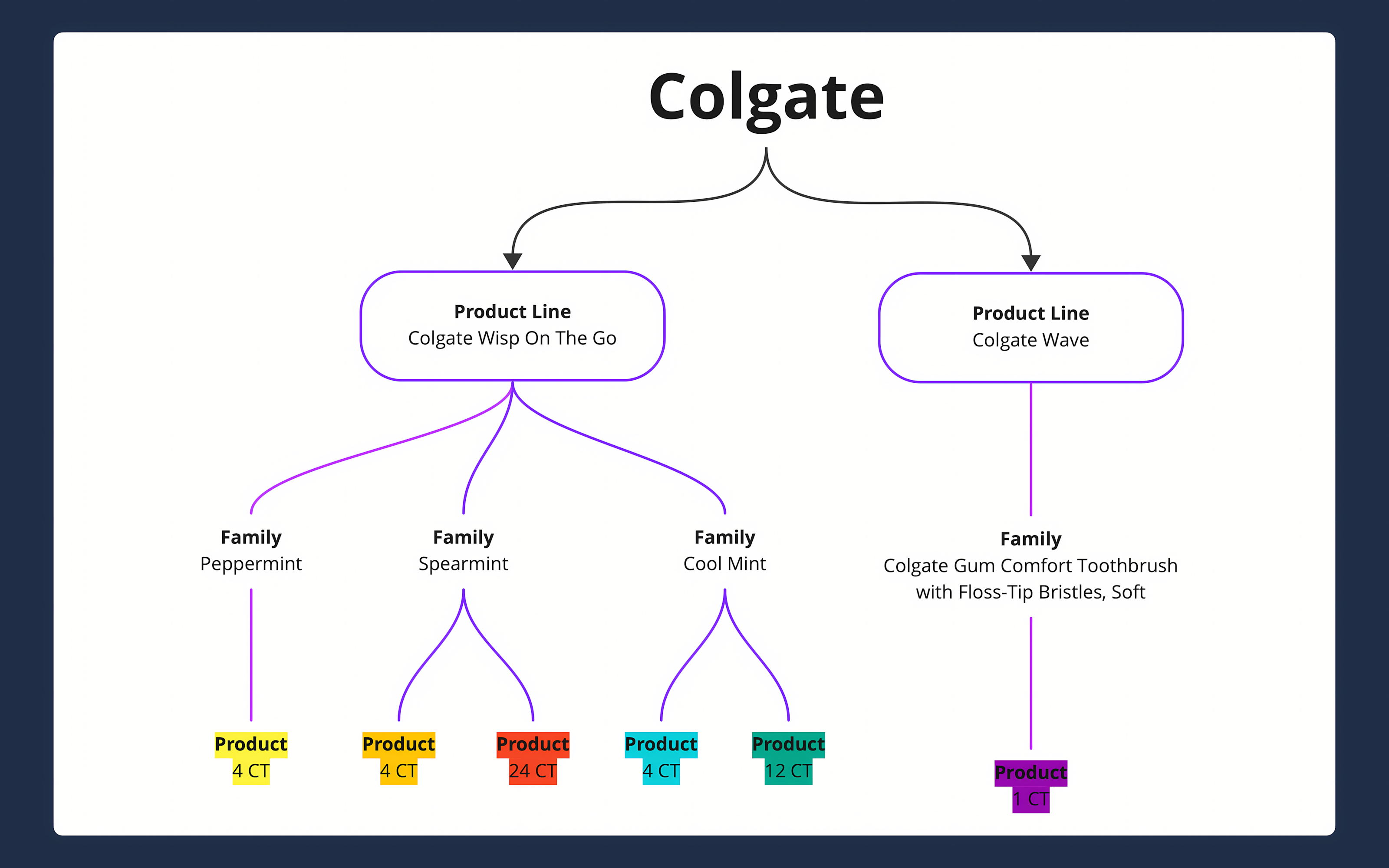
Mapping the Product Catalog Visual mapping of product families, lines, and SKUs clarified catalog structure and enabled us to design a search and filter system that matched real user mental models and business logic.

Benchmarked against best-in-class “where to buy” features (Ben & Jerry’s, Chobani). User testing revealed the search needed to be more prominent. Unmoderated tests with recent dental shoppers validated the need for a search feature and informed our design direction.

Rapid wireframing in Figma enabled fast iteration and clear communication with PM and engineering. Early concepts focused on core usability issues, allowing us to quickly validate and refine the approach with real users.

Explored multiple design patterns—search-first, filter-first, hybrid—then narrowed to the most effective flows for user testing and client review. This iterative process ensured we balanced business goals and user needs.

User research surfaced a top pain point: users wanted to filter out kids’ products. We introduced an “Adult/Kids” filter, directly addressing this need and improving product findability.
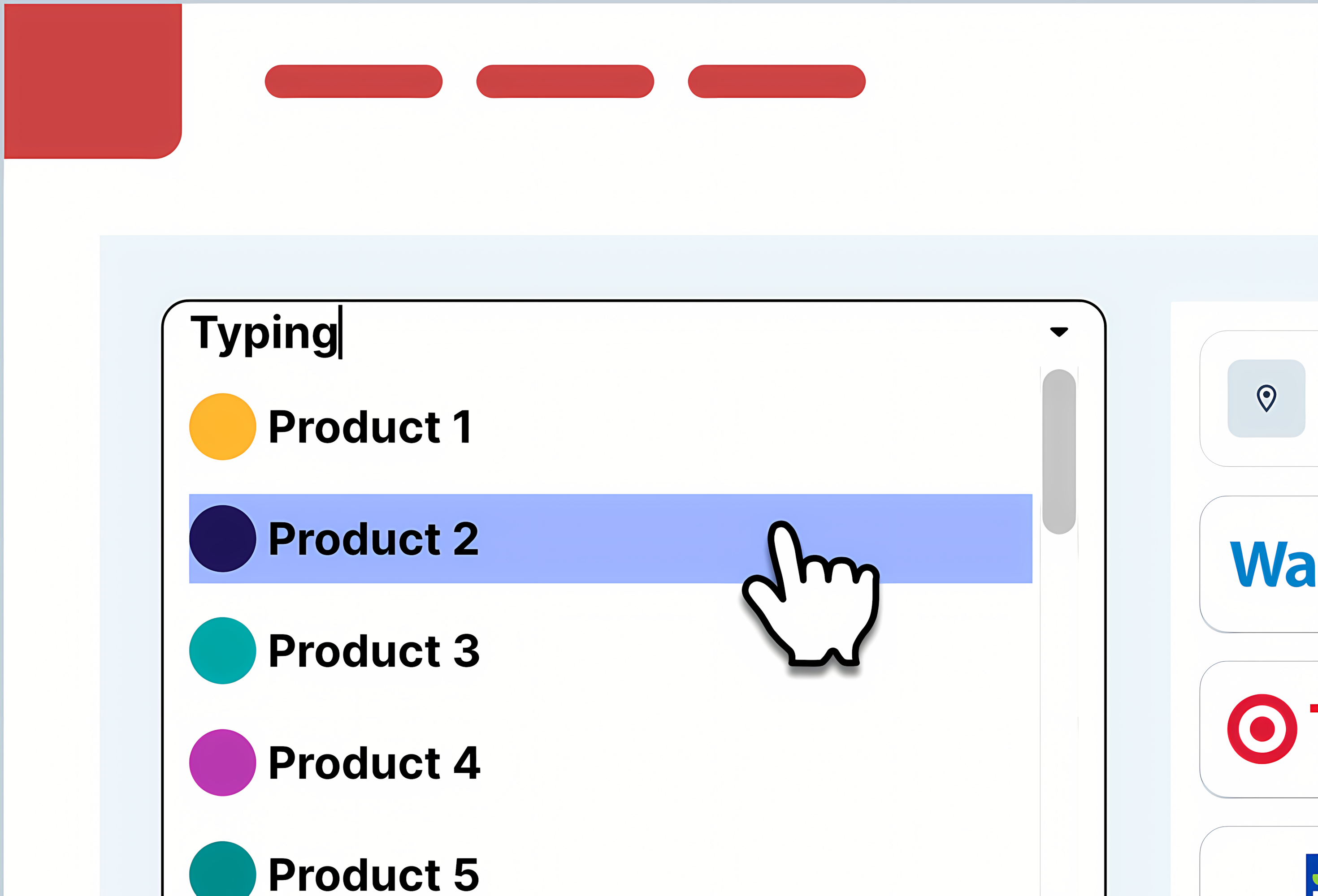
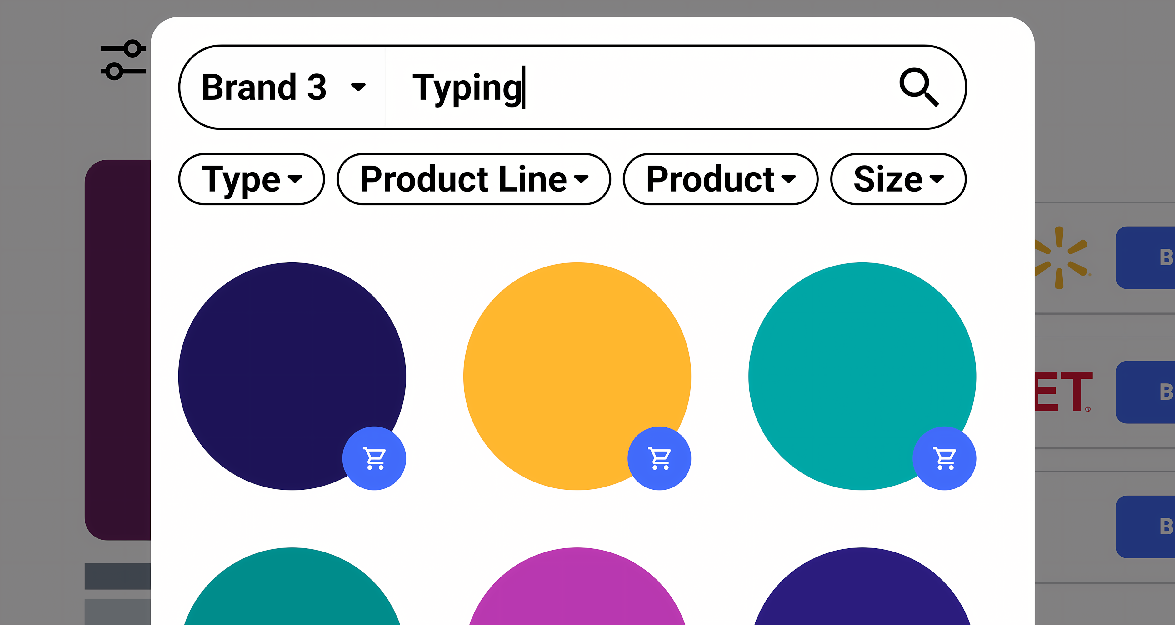
Added images to dropdown search results and limited the number of results shown, making it easier for users to recognize products and reducing cognitive load. All changes were reviewed with engineering and the client for feasibility.
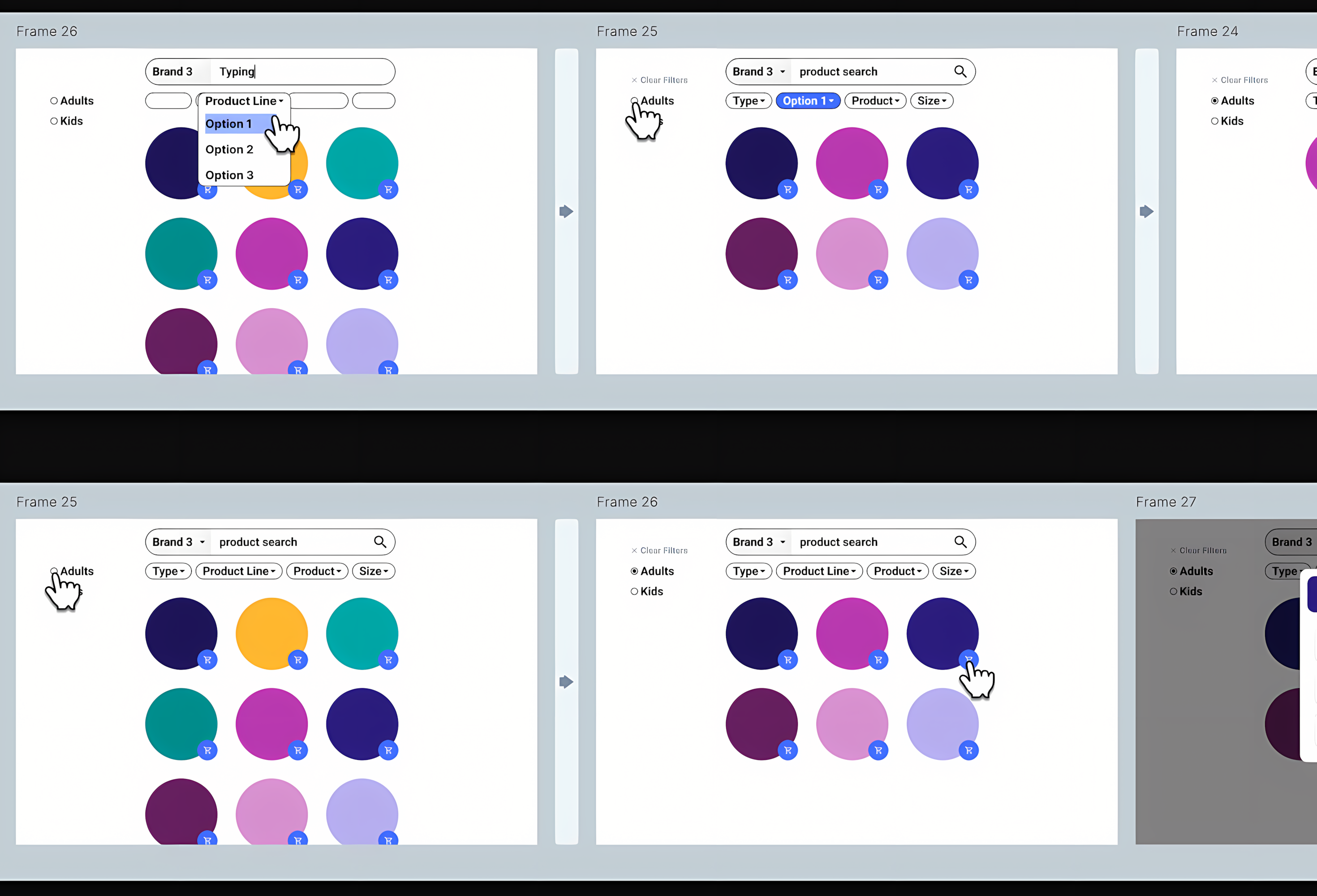
The UX kit enabled us to clearly communicate different search/filter flows and their order. Color-coding and visual cues helped align expectations with the brand’s catalog and ensured the right filtering logic.
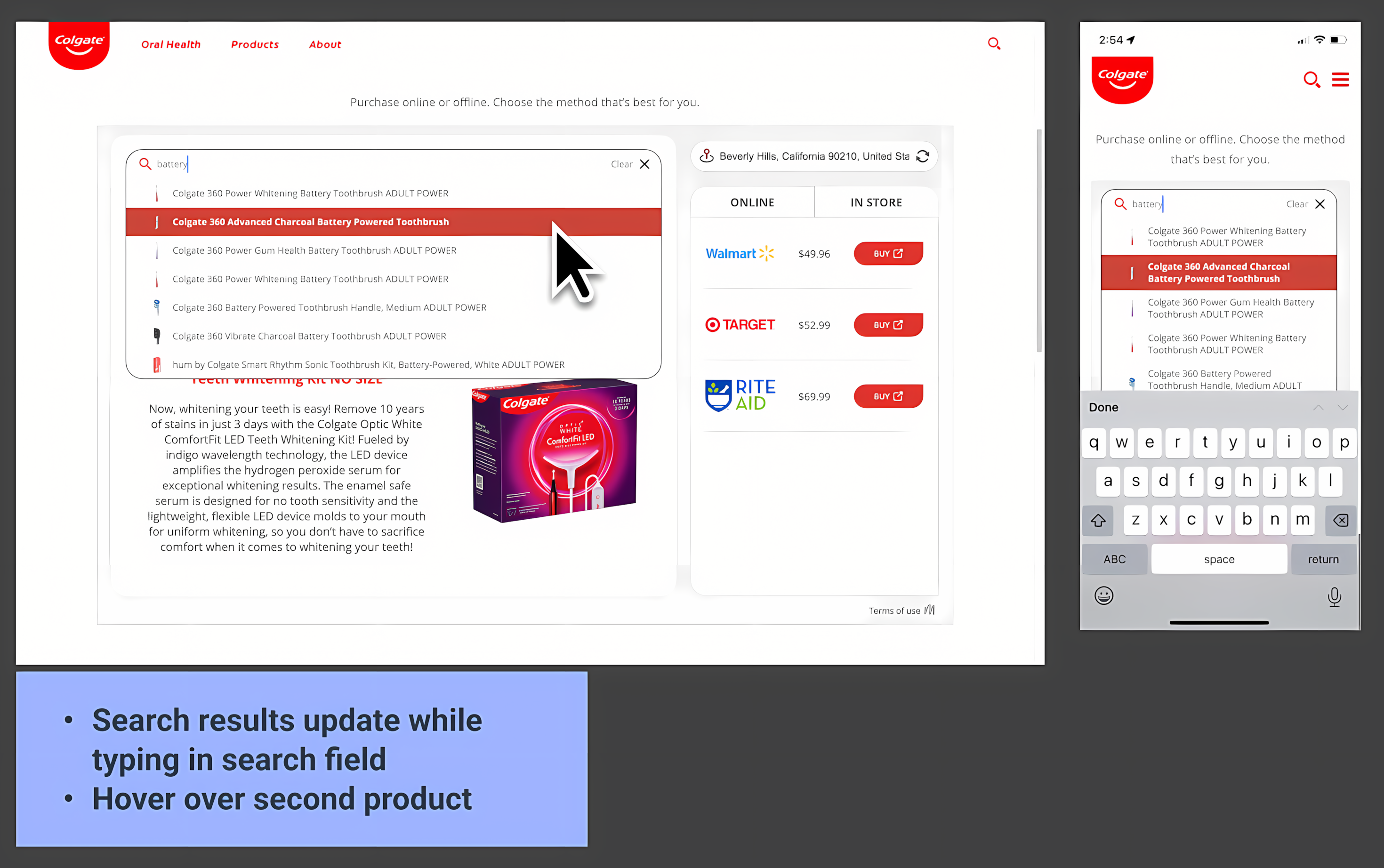
Final flow diagrams captured improvements and set clear expectations for both desktop and mobile. This ensured a seamless user experience and alignment with Colgate’s requirements.
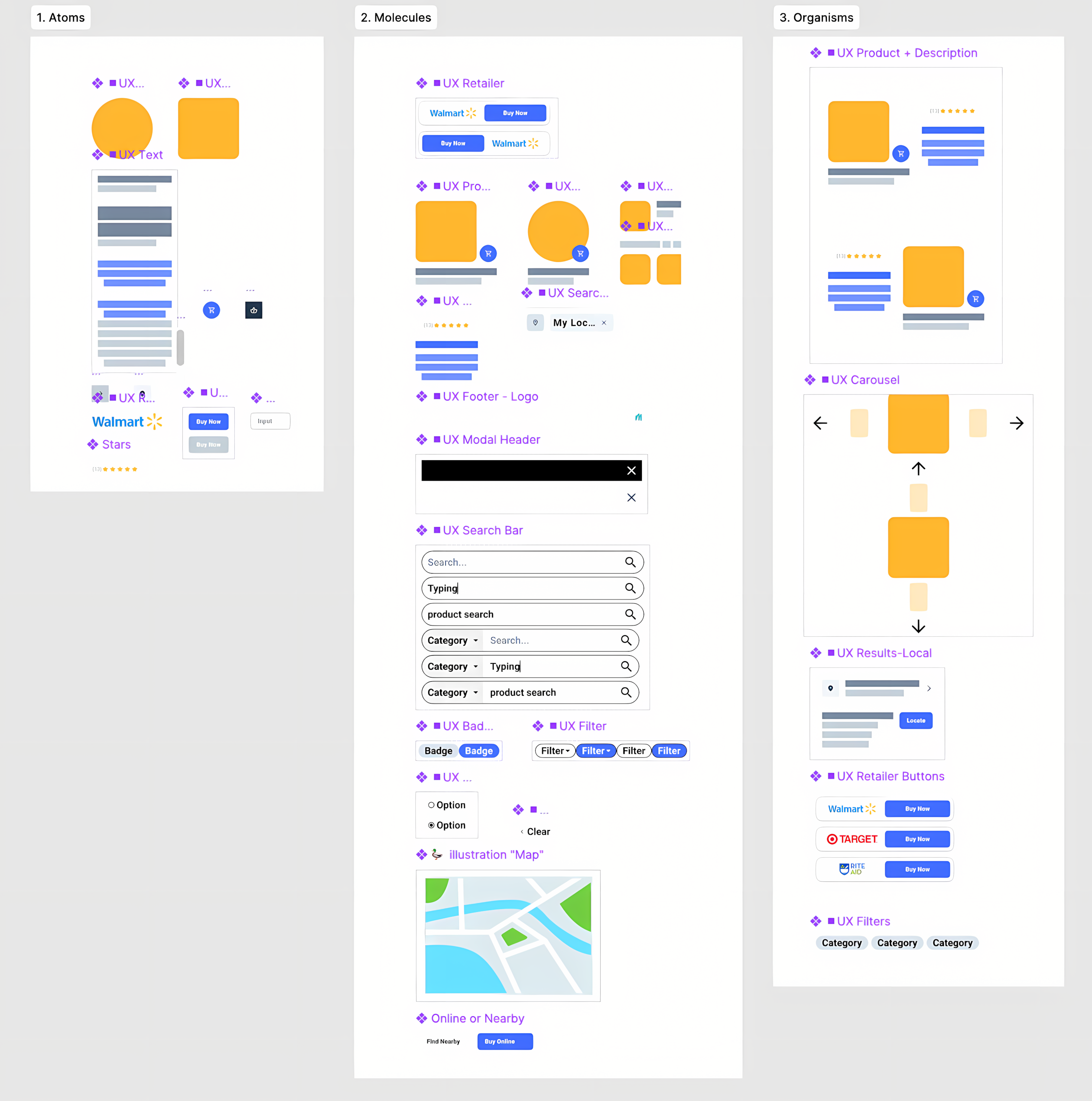
The UX kit became a modular library of reusable components, states, and layouts. After launch, it was adopted for other major clients (e.g., Nestle), demonstrating scalability and impact.
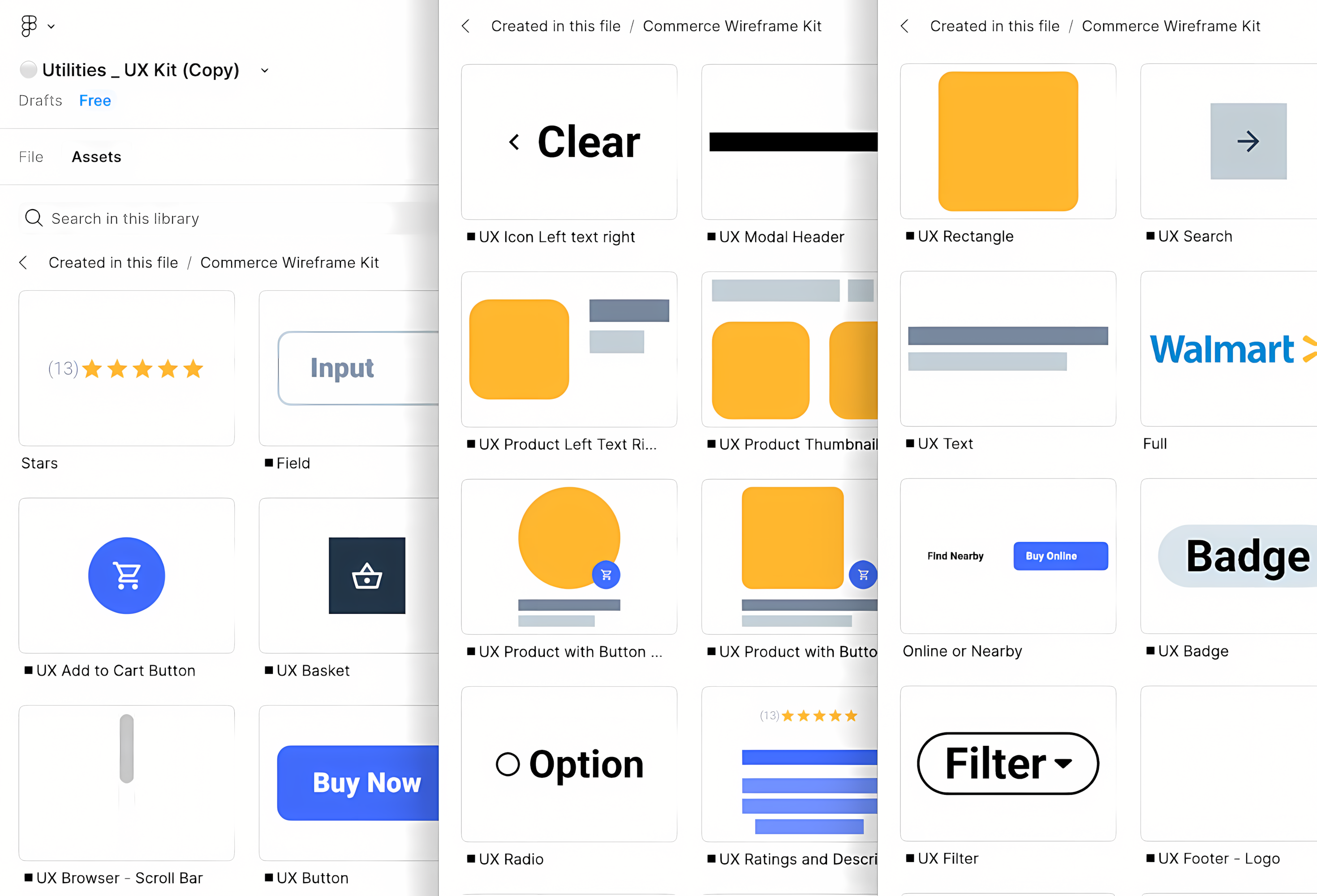
Publishing the UX kit in Figma enabled rapid prototyping and efficient creation of design concepts for future projects, streamlining workflow and supporting continuous improvement.
Results & Business Outcomes
The new Colgate search experience launched with positive feedback from users and the Colgate team. User testing scores improved (5/5 on usability for new flows), time to find products dropped, and satisfaction increased. The reusable UX kit became a valuable asset, enabling rapid prototyping and adoption by other major clients.
- Positive Feedback: New search feature improved satisfaction and was requested by other customers (the “Colgate Template”)
- Usability Metrics: User testing scores improved, and product search time decreased
- Scalable System: UX kit adopted for other clients (e.g., Nestle), demonstrating impact beyond Colgate
Takeaways & Next Steps
User-centered research and rapid prototyping led to a solution that balanced business goals and real user needs. The project delivered not just a better Colgate experience, but a scalable design system for future work. Next: use search data insights to further refine Colgate’s site and continuously improve the user experience.
