Challenge
We were tasked with creating all-new design guidelines and a new logo and then applying the new branding across everything in the company. This would be tackled in-house by a small but mighty design team with huge ambition, creativity, and passion.
Solution
I utilized style tiles in the early design phase to rapidly iterate on tone, typography, and color. I worked closely with the product and marketing teams to ensure this would translate well across advertising and software.
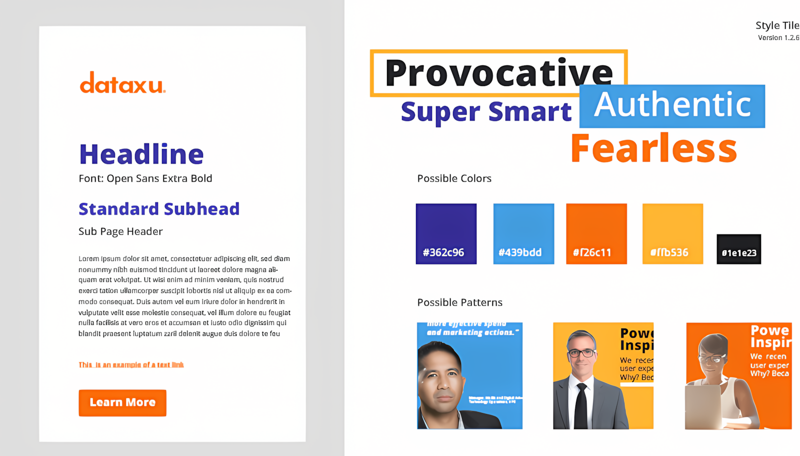
This is one of the dozens of style tiles created to communicate design options with the team. I chose style tiles as a method to rapidly iterate on color, typography, and pattern variations. This allowed us to get feedback early and often.
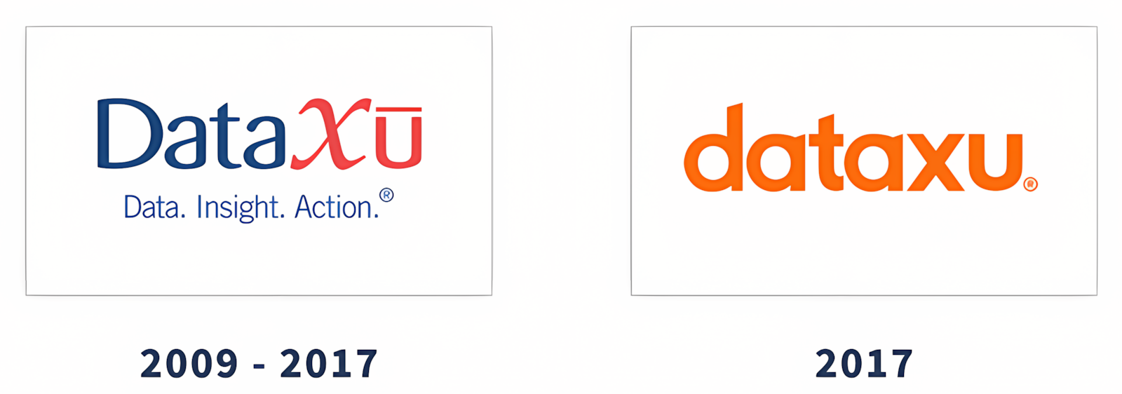
The new logo is a modern and friendly leap forward. We decided to go all lower case as a way to reinforce our commitment to change and appeal to a wider audience.
The dataxu team poses below the new logo at dmexco 2017 in Germany.
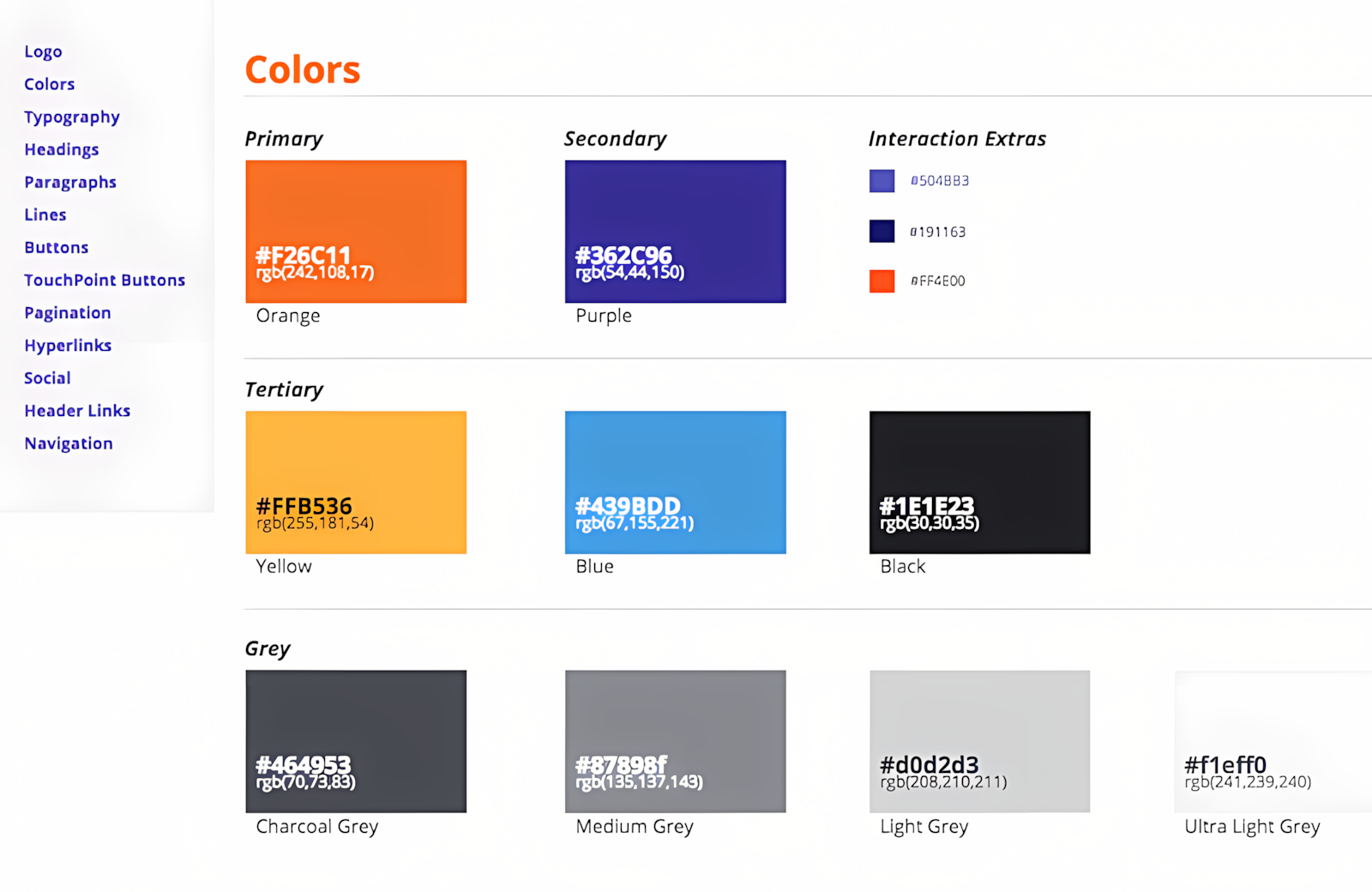
The new style guide allows easy access for anyone to grab the brand colors, button specs, typography and more as needed. I chose primary and secondary colors with enough contrast to pass a minimum of WCAG 2.0 for accessibility.
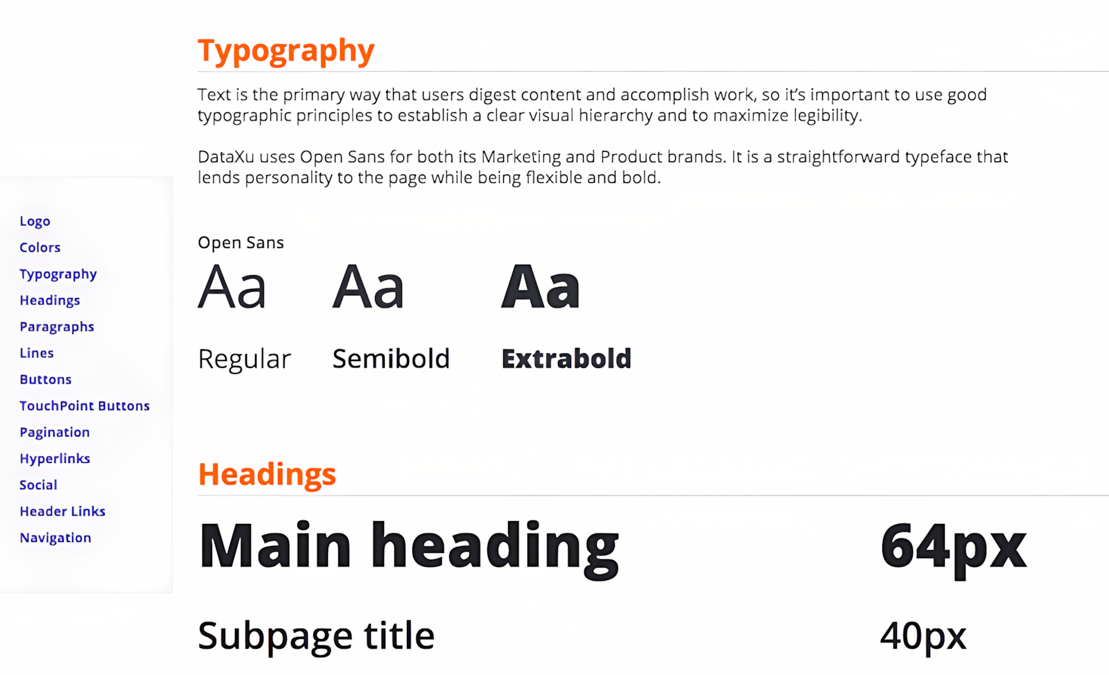
The style guide contains all necessary elements with a big focus on typography. I also created a shared component library for prototyping to consistently apply the new branding and save time on development.
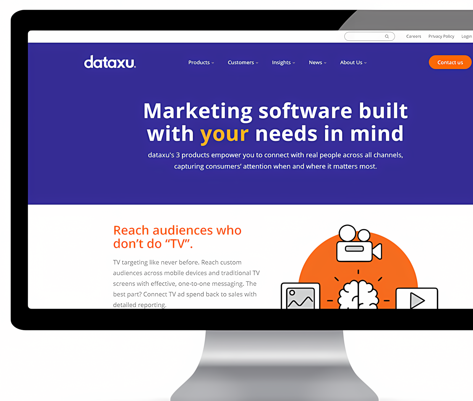
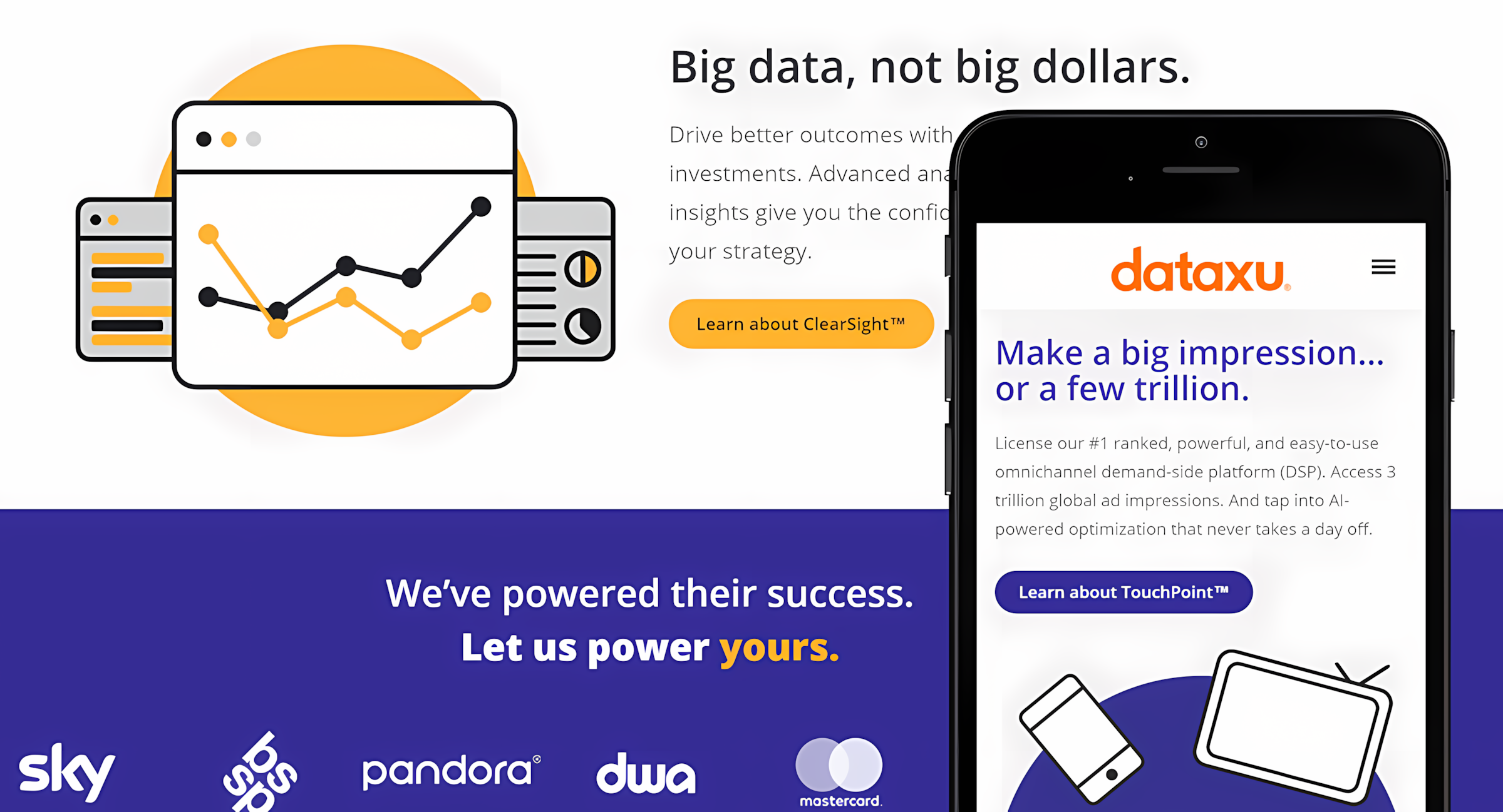
The new products page showcases the bold new colors, thoughtful typography, and overall modern look and feel.
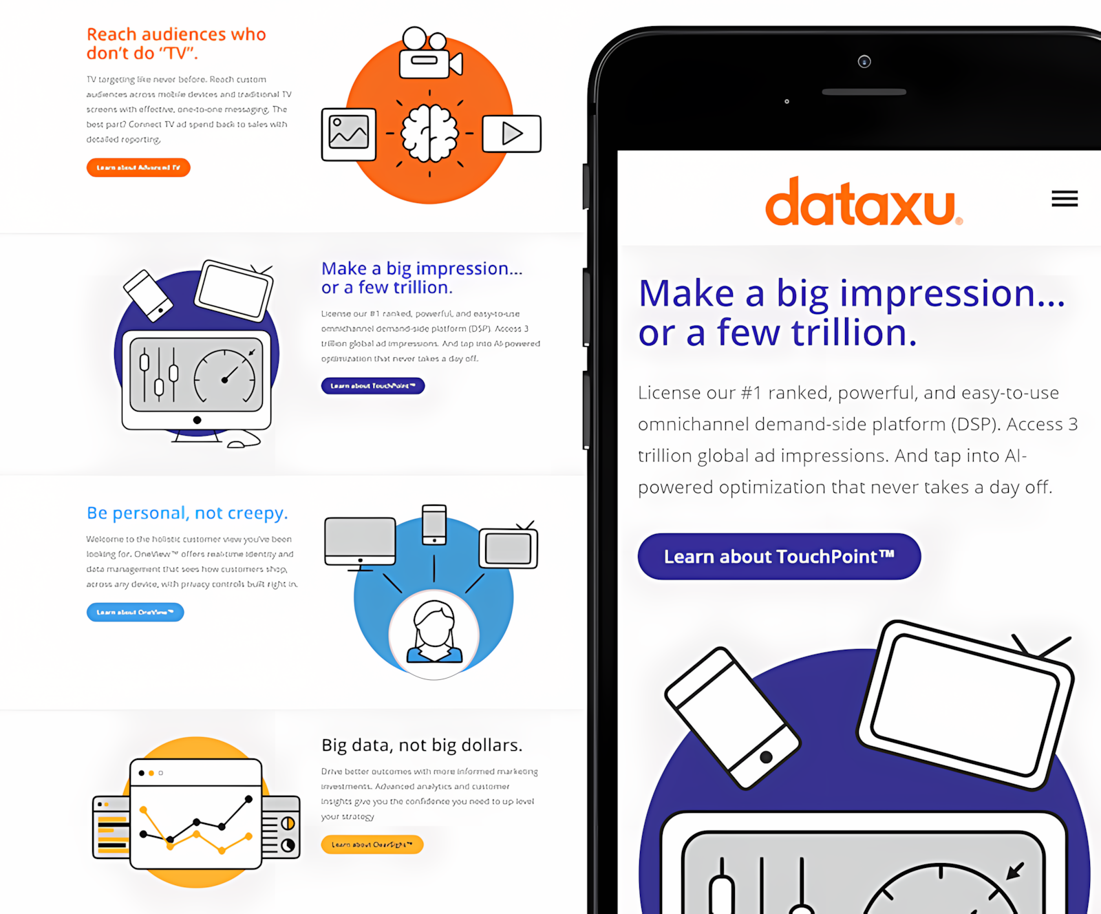
The new illustration style allows the marketing team to articulate complex products in a simple approachable manner.
The new landing page style is designed to be easier to read by utilizing white space, fewer buttons, and less clutter.
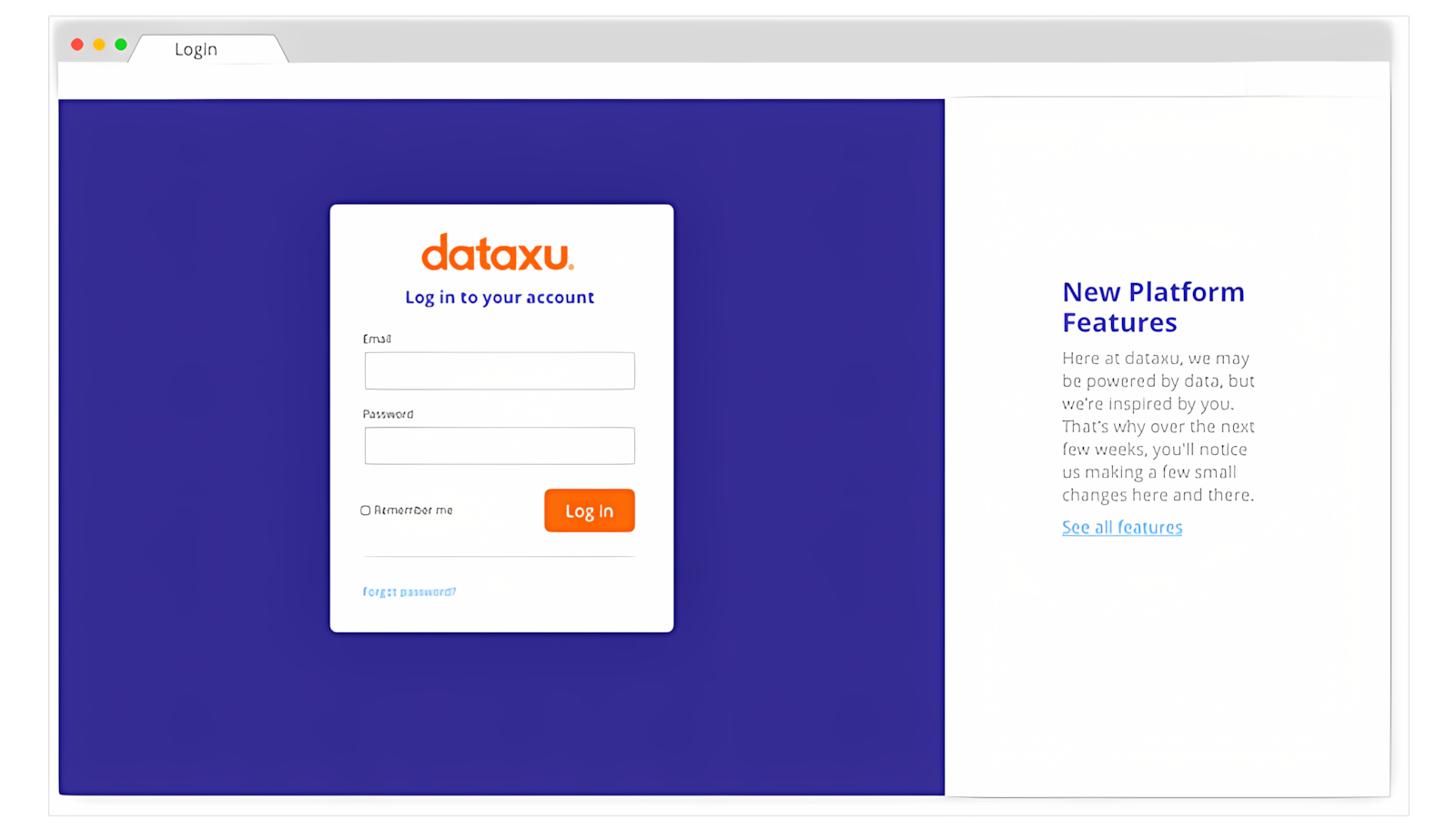
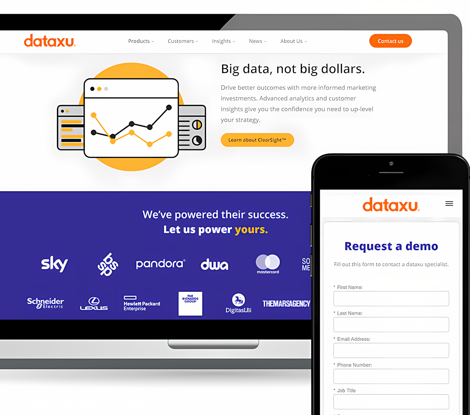
One of the new login page mockups showcases the new logo with a simple background and dedicated space on the right for messaging to users.
Results
After dozens of iterations, we presented a range of design applications and examples to the executive team and gained their approval. The results of the rebrand launch were overwhelmingly positive. Clients and employees alike shared a mutual appreciation for the following:
- Bright color palette, and imagery that is centered around the user
- A new identity and design system
- A modern new logo
- A new prototyping kit
- A feeling of energy, boldness, and warmth
