Challenge
When OneView was originally launched, the functionality became one of the company's most important products. The product team needed a user interface to select targeting and clearly illustrate the tradeoffs between accuracy and scale.
Solution
I rapidly iterated on several prototypes for the OneView component. The options inform users in a variety of ways how OneView can be used for targeting. This was solved by using icons and illustrations to communicate that as the scale goes up, accuracy goes down.
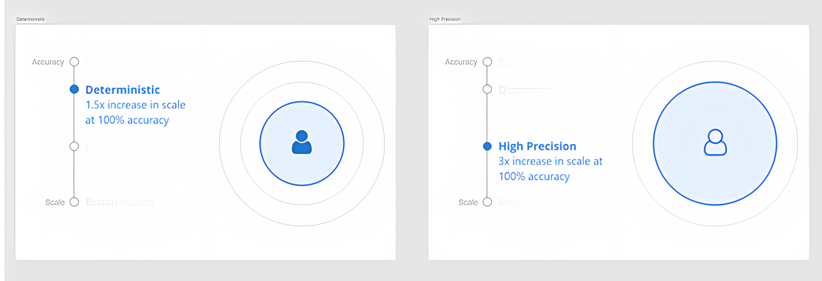
As the targeting changes from "Deterministic"to "High Precision,"the rings increase to represent an increase in scale, while the outlined icon represents a decrease for accuracy.
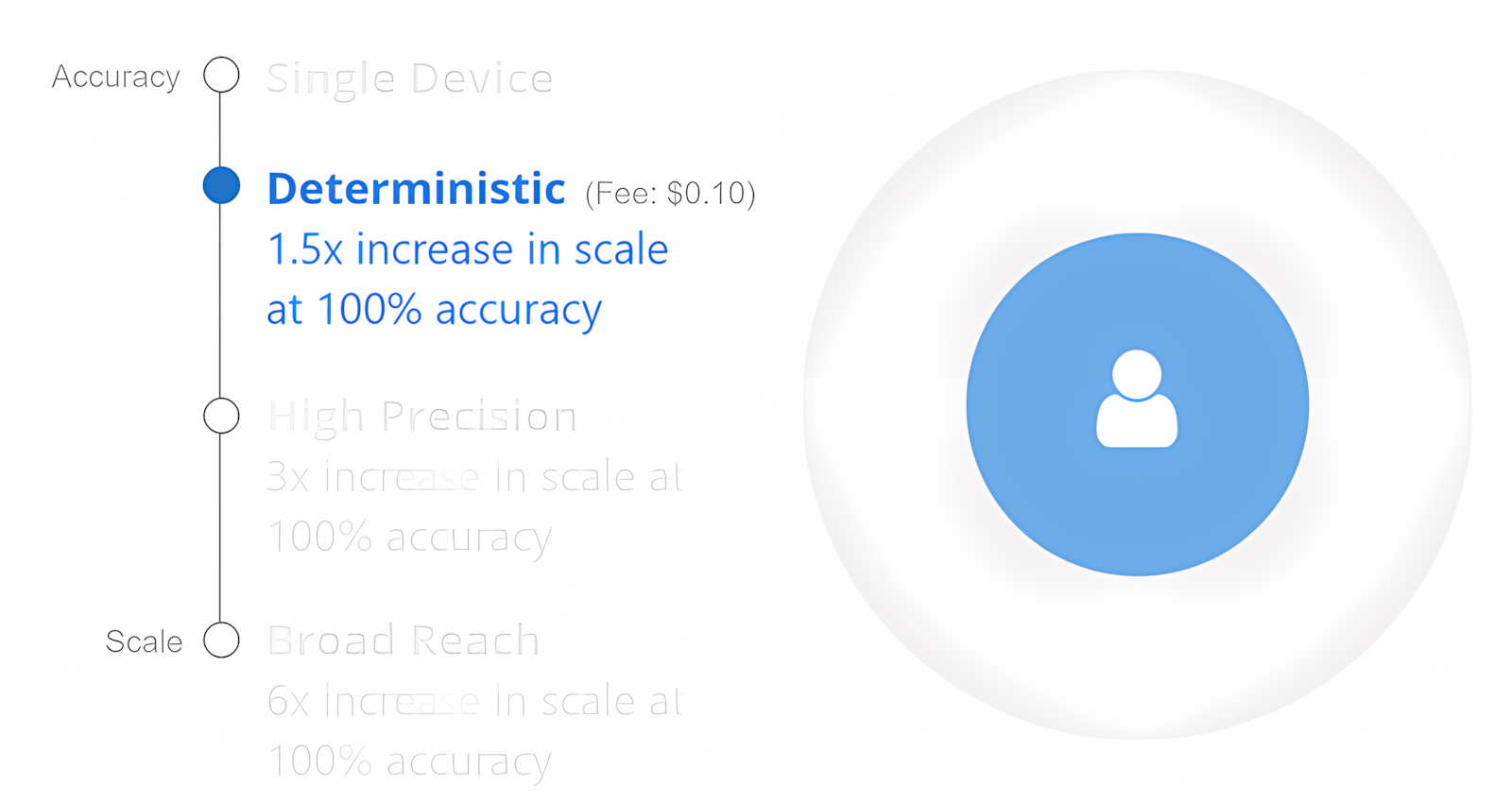
I tested a variety of different styles to ensure the product team had a range of options to choose from.
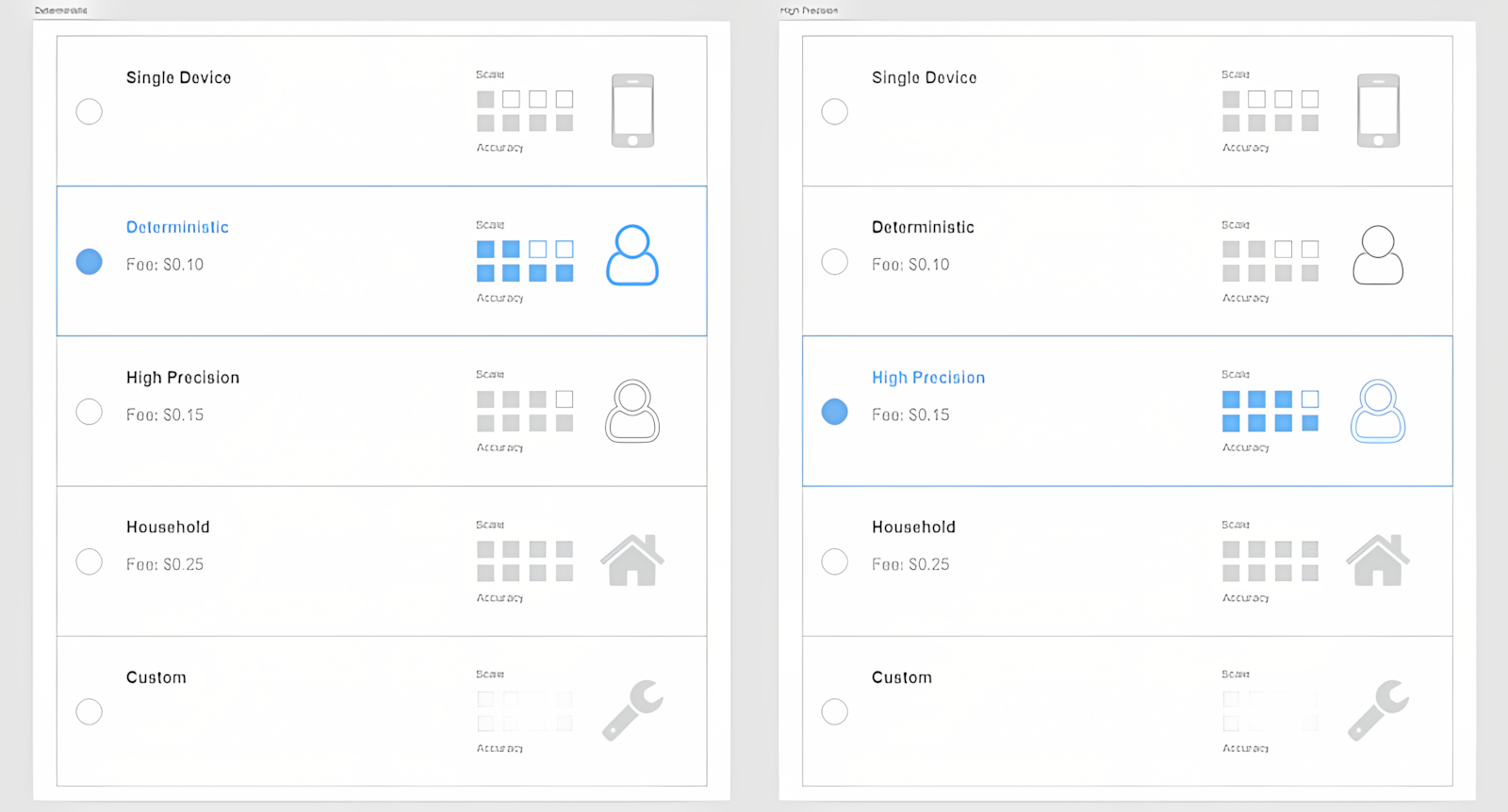
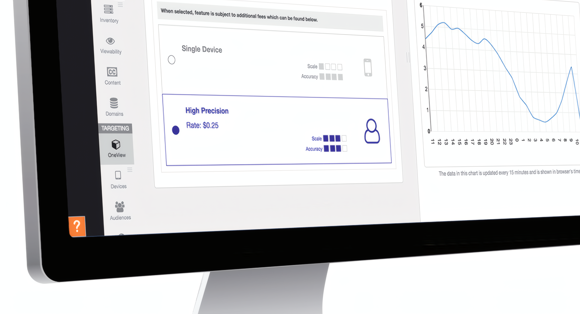
The final option was chosen and built into the dataxu platform. We settled on small blocks to represent scale and accuracy to ensure the tradeoff was clear to the user.
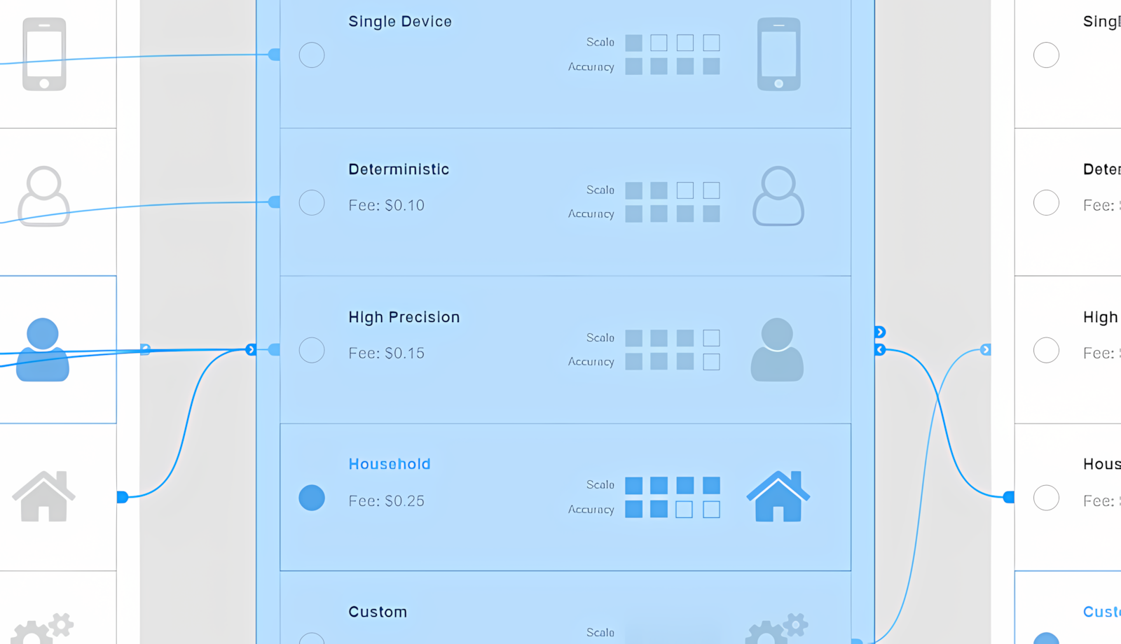
I created clickable prototypes of each option to demo to the product team. This allowed them to click through the different levels of targeting and accurately visualize the solutions.
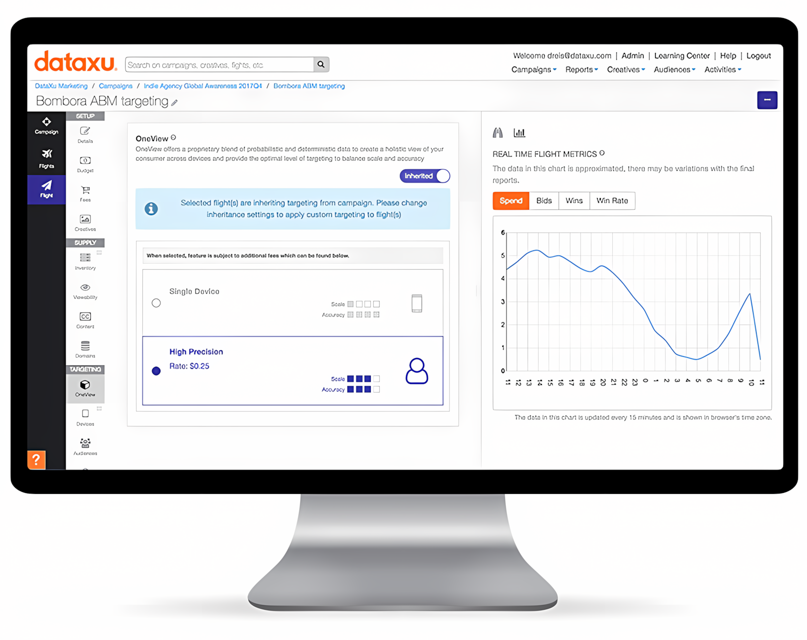
Here is the final implementation of the OneView component as seen in the dataxu platform. The blocks representing tradeoffs are represented in the chosen option, while the other option is disabled.
Results
The use of rapid iterations and clickable prototypes proved successful for the dataxu product team. They were able to quickly move forward with the interface that best suited their vision and easiest to understand interface. Ultimately this helped users get the most out of the advanced targeting features.
